Lesson 5. Laguna
In Lesson 5, we continue exploring the luminous side of atmospheric painting, the warm glow of the sky and how it reflects on water and land.
This lesson includes a Paint Library study of Opera Rose and Transparent Orange, two vivid pigments that bring life and light into sunsets and reflections.
You will complete two exercises that explore aerial perspective and learn how to observe and paint clouds: their shapes, softness, and how they change with distance and light.
The main painting, “Laguna”, brings together everything we’ve learned about atmosphere, colour harmony, and light infusion – creating the impression of glowing air through large, blended washes and soft transitions.
Orange 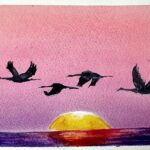
Opera Rose 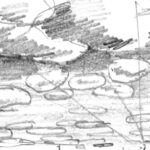
Clouds with Pencil 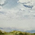
Clouds with Watercolour 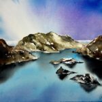
Laguna
Use these buttons to navigate the lesson content
Please use this navigation button to jump directly to the homework upload section at the bottom of the lesson page
Part 1. Paint Library ORANGE
Take your time and enjoy the process, this exercise is about discovery, not perfection. Think of this as play, not work, let curiosity guide you, and allow yourself to be surprised by the beautiful mixes that appear on your page.
Please, click on the button to watch videos and read about the Paint Library System before you start the first exercise
Explore the warmth of Transparent Orange – a bold, energetic pigment that glows beautifully in sunrise and sunset palettes. You’ll see how it interacts with cooler blues and violets to create light-filled transitions.
Estimated time to complete this exercise:
Creating the mixing charts will take about 1 to 1.5 hours, plus an additional 45 minutes for the sketch.
The Story of Orange
Though named after the fruit in the 16th century, orange pigments existed long before – most often as mixtures of red and yellow.
In the 19th century, artists gained access to brighter, more stable oranges like cadmium orange.
The colour symbolized warmth and vitality: Turner’s blazing sunsets, Gauguin’s tropical heat, and Kandinsky’s emotional intensity all found expression in orange.
It remains a colour of energy, glowing between the brilliance of yellow and the passion of red.
Orange in Today’s Palette
In Watercolour: Orange shines in transparent washes for autumn leaves, fruit, and sunsets.
In Mixing: Use yellow + red for fresh, varied oranges; add blue to mute into earthy browns.
In Atmosphere: Orange radiates warmth, friendliness, and vitality.
For the modern painter, orange is less about subtlety and more about glow, best in moments of radiance.
Materials used for the video demonstrations:
Watercolour Art Journal, Strathmore, 8.5 x 5.5, paper 140 g
Artistic tape, 3mm and 5 mm
Watercolour brush
- Flat brush, 1 1/2, Japan
- Mop brush, 10 mm, Paul Rubens size 6
- Calligraphy brush, 3 mm
- Fan brush (for sketch, optional)
Pencil, eraser, paper towels, water, hair dryer
Watercolour paint:
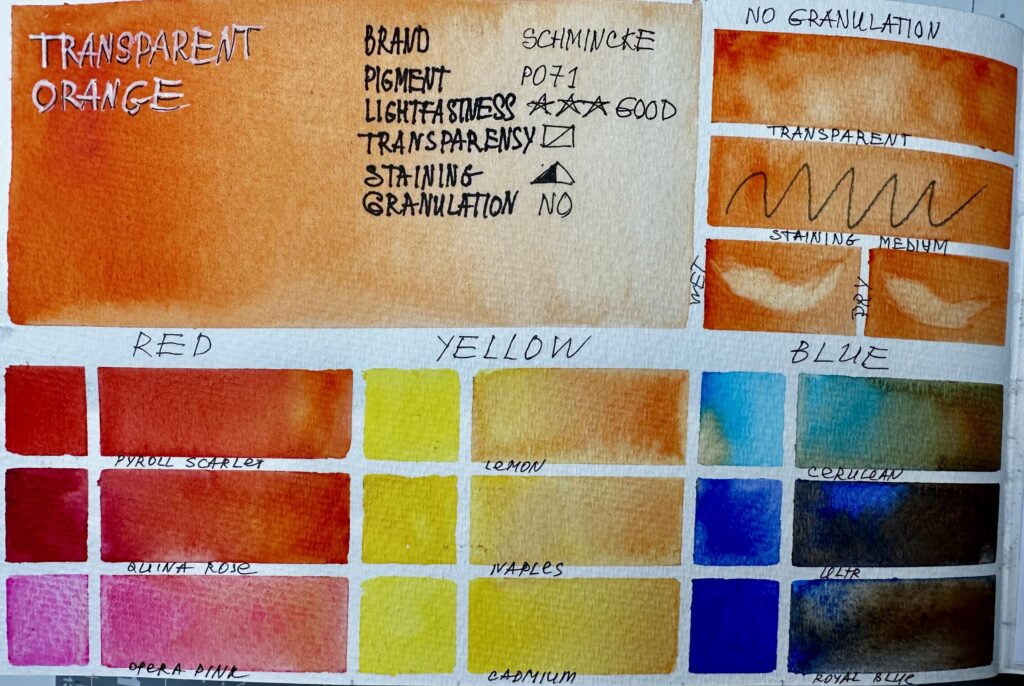
Colour to study: Transparent Orange, Schmincke
For RED block you can use any three red colours from your collection. For the video demonstration Payroll Scarlet, Quinacridone Rose and Opera Rose
For YELLOW block you can use any three yellow colours from your collection. For the video demonstration Lemon Yellow, Naples Yellow and Cadmium Yellow were used.
For BLUE block you can use any three blue colours from your collection. For the video demonstration Cerulean Blue, Ultramarine and Royal Blue were used.
For COMPLEMENTARY block you can use any violet-purplish colours from your collection. For the video demonstration Azure, Prussian Blue and Delft Blue were used.
For WARM block you can use any three warm-yellow-redish-brownish colours from your collection. For the video demonstration Yellow Ochre, Burnt Sienna and Quinacridone Gold were used.
For COLD block you can use any three cold-bluish colours from your collection. For the video demonstration Phthalo Blue, Magenta and Cobalt were used.
For ADDITIONAL MIXES block you can use any three colours from your collection. For the video demonstration Buff Titanium, Lavender and Viridian were used.
For COMBINATIONS TO TRY WITH THE STUDY COLOUR block you can use any colours from your collection. Please choose any two colours, mix them and add the study colour. For the video demonstration Burnt Umber, Cerulean, Ultramarine, Opera Rose, Quinacridone Gold, Burnt Sienna, Cobalt Turquoise, Lavender, Payroll Scarlet, Cadmium yellow, Magenta, Quinacridone Rose, Aussi Red Gold, Cobalt and Viridian were used.
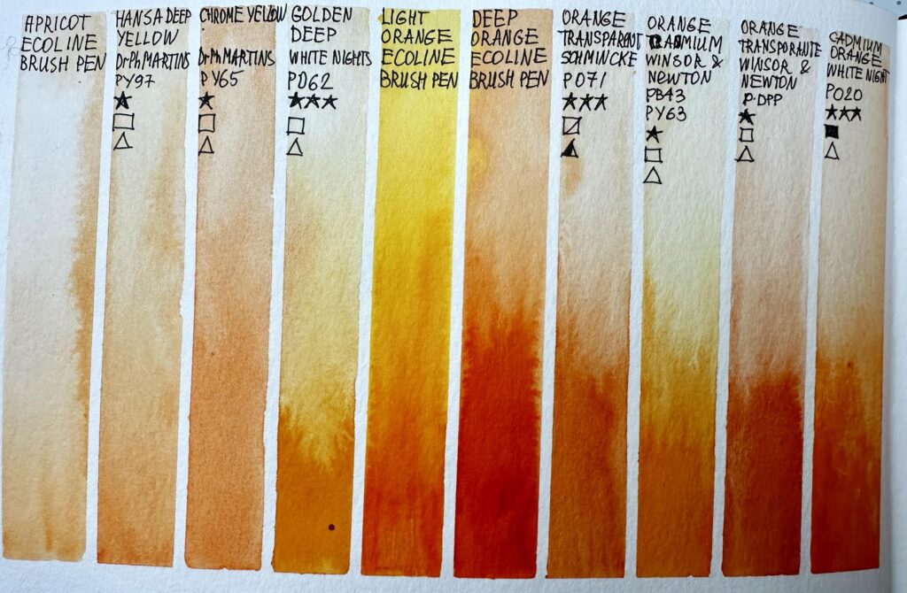
For COMPARISON CHART use all brands of the study colour from your collection, additionally you can compare any yellow colours that you have.
For creating the comparison chart the following paints were used:
- Apricot, ECOLINE brush pen
- Hansa Deep Yellow, Dr Ph Martins
- Chrome Yellow, Dr Ph Martins
- Golden Deep, White Nights
- Light Orange, ECOLINE brush pen
- deep Orange, ECOLINE brush pen
- Transparent Orange, Schmincke
- Orange Cadmium, Winsor&Newton
- Transparent Orange, Winsor&Newton
- Cadmium Orange, White Nights
- Titian Red, White Nights
- Aussi Red Gold, Daniel Smith
- Quinacridone Gold, Winsor&Newton
- Indian Yellow, M.Graham
- Quinacridone Burnt Orange, Daniel Smith
- Shaffron Yellow, ECOLINE brush pen
- Burnt Sienna, ECOLINE brush pen
- Vermilion, Van Gogh
- Vermilion, ECOLINE brush pen
For SKETCH Aussi red Gold, Orange Transparent and Payne's Grey were used.
Also you will need white gouache. Alternatively you can use white acrylic marker, COPIC WHITE or BLEED PROOF WHITE by Dr PH Martins.
To print:
Please transfer the selected layout onto your watercolour paper (journal) by using pencil or artistic tape.
Please print “OVAS PL Orange Text“, fold it in half and trim the paper to fit the size of your art journal (format A5) or leave it as is if you use A4 format. Use clear tape to attach it to the journal.
OVAS PL Orange Text 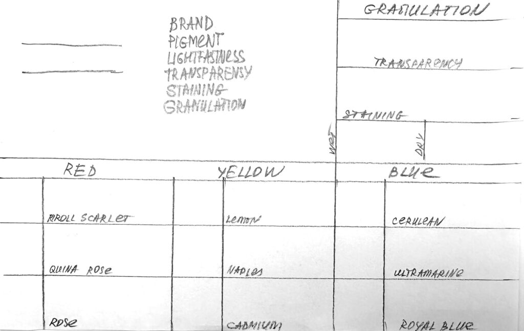
OVAS Paint Library Page Layout 1 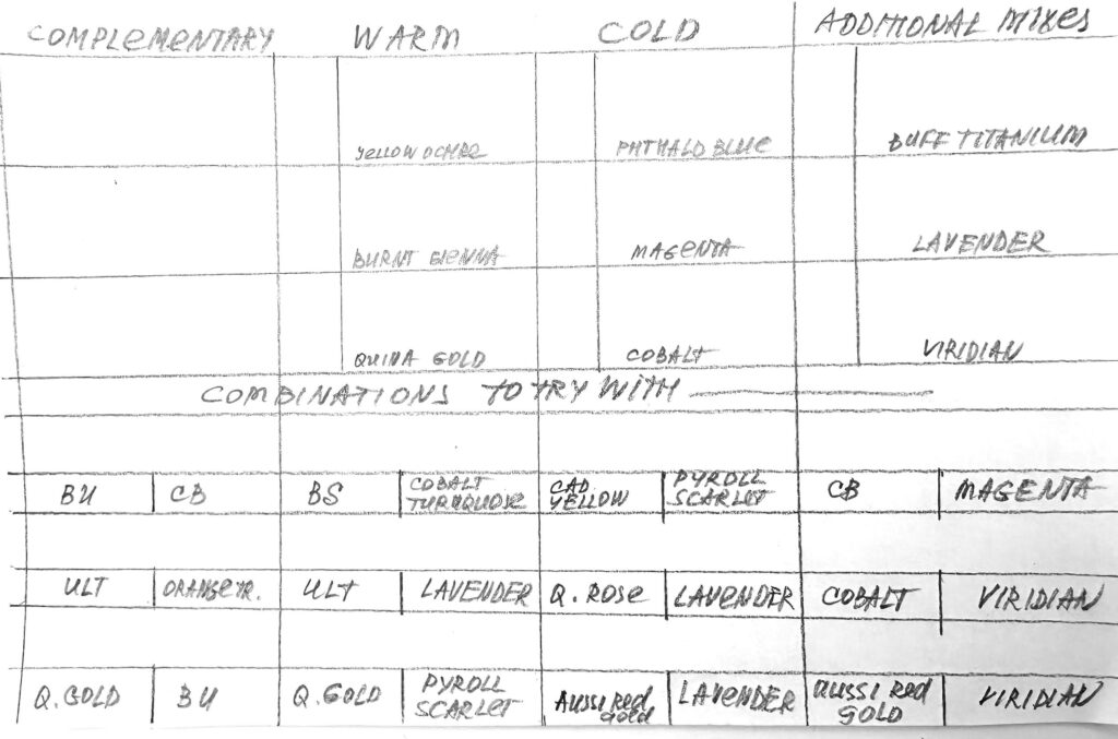
OVAS Paint Library Page Layout 2 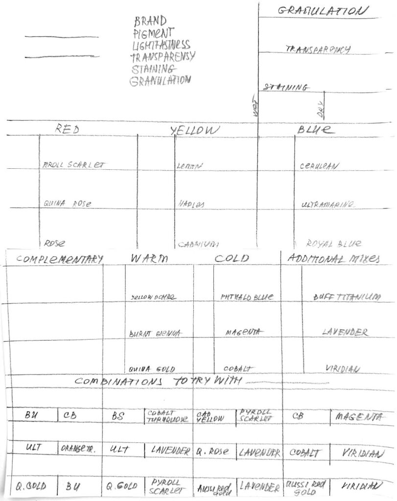
OVAS Paint Library Page Layout 3
Please watch this video first, and then repeat after me or create your own mixing chart to create Blocks/Pages 1 and 2 for your Paint Library.
PL Orange 1 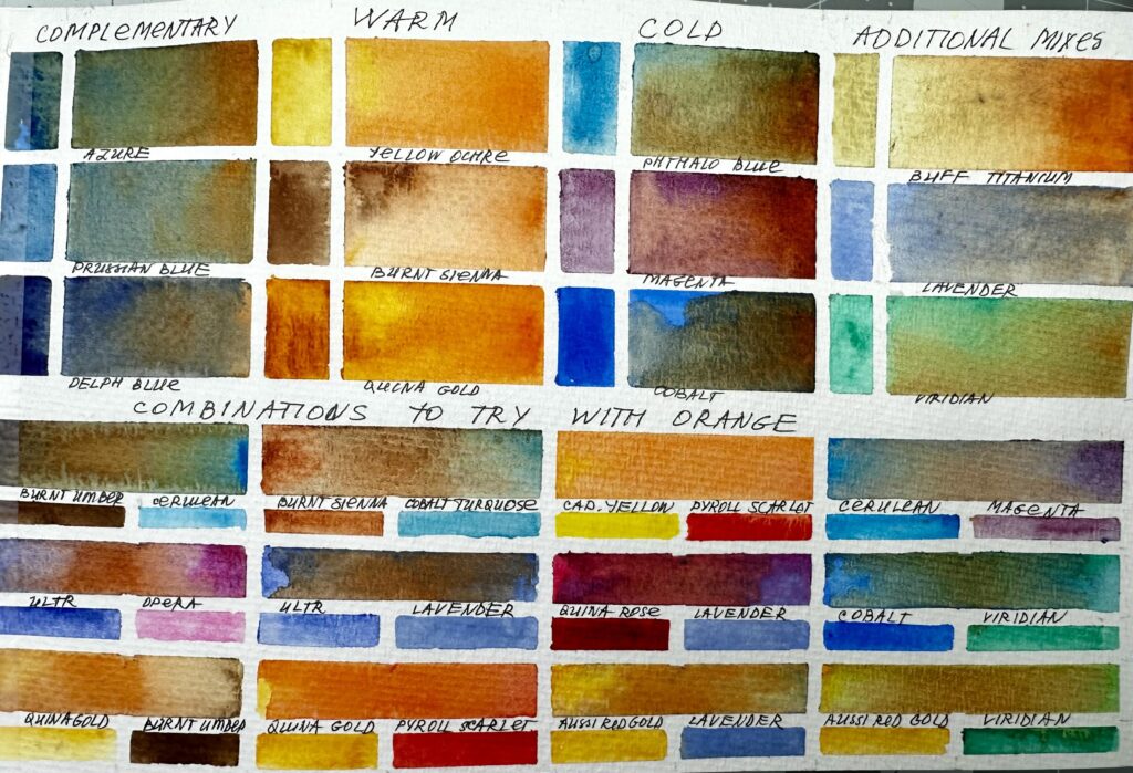
PL Orange 2
To create the comparison chart for Block/Page 3 of your Paint Library, simply divide the page into vertical columns, covering the top and bottom rows with tape. When applying paint, build a smooth gradation—dark at the bottom, fading to light at the top. The lighter section of each colour column will provide space for you to note down the characteristics of that paint.
Over time, you can expand your comparison chart by adding “similar” paints. This is a great way to explore your collection more deeply and discover subtle differences between brands or hues
Pl Orange 3-1 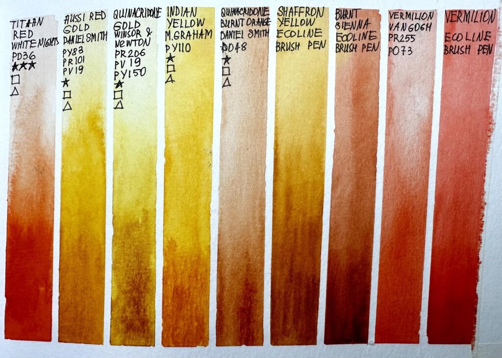
PL Orange 3-2
In Block/Page 4 of your Paint Library, we will practice sketching with the colour – Transparent Orange. You will use an additional colours: Aussi Red Deep and Payne’s Grey.
OVAs PL Orange Sketch
Please watch the video(s) first, then take your time to practice the exercises; as many times as you wish.
When you’re satisfied, choose your best result and take a clear photo of your work. Try to photograph it in daylight with soft, diffused light to avoid harsh shadows.
Before uploading, crop the image so it shows only the painting; please don’t include mats, frames, or any background.
Finally, upload your result in the window below. Thank you and enjoy your painting!
Discover the radiant beauty of Opera Rose – a luminous pink that can shift from delicate blush tones to vibrant sunset hues. We’ll study its transparency, mixing range, and how it brings brilliance to skies and reflections.
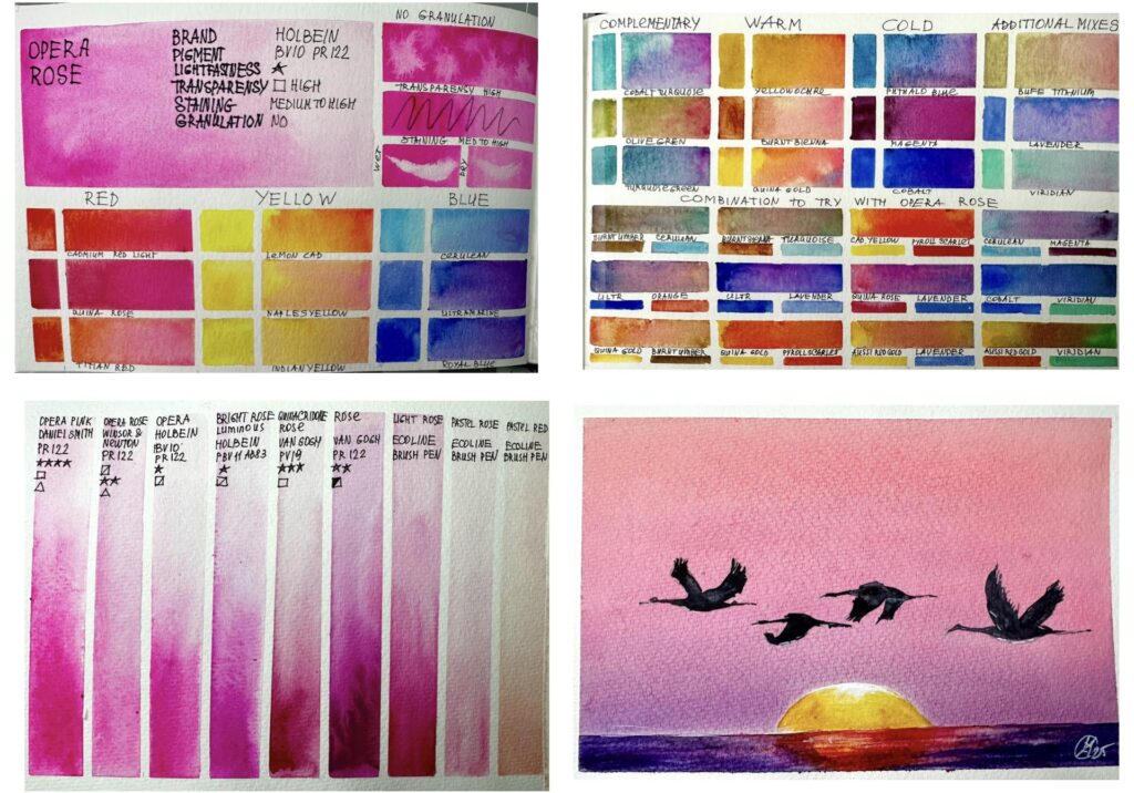
The Story of Opera Pink
Opera Pink is a modern invention, a fluorescent pigment developed in the 20th century that captivated watercolorists with its almost neon brilliance.
Unlike historic reds and pinks, Opera Pink was never meant for permanence (it fades in light), but its glow made it irresistible.
It became especially popular in florals and contemporary art, where vibrancy and immediacy mattered more than tradition.
In many ways, Opera Pink is a symbol of modern watercolour: bold, playful, and unapologetically bright.
Opera Pink in Today’s Palette
In Watercolour: Opera Pink is radiant, nearly glowing, and works best in small, concentrated passages.
In Mixing: With yellows, it creates lively corals; with violets, dazzling magentas; with blues, radiant purples.
In Atmosphere: Opera Pink suggests playfulness, blossoms, and joy, it feels alive.
Though not lightfast, Opera Pink remains beloved: a modern spark of brilliance that can make a painting sing.
Materials used for the video demonstrations:
Watercolour Art Journal, Strathmore, 8.5 x 5.5, paper 140 g
Artistic tape, 3mm and 5 mm
Watercolour brush
- Flat brush, 1 1/2, Japan
- Mop brush, 10 mm, Paul Rubens size 6
- Calligraphy brush, 3 mm
Pencil, eraser, paper towels, water, hair dryer
Watercolour paint:
Colour to study: Burnt Sienna, Van Gogh
For RED block you can use any three red colours from your collection. For the video demonstration Cadmium Red Light, Quinacridone Rose and Titian Red
For YELLOW block you can use any three yellow colours from your collection. For the video demonstration Lemon Yellow, Naples Yellow and Indian Yellow were used.
For BLUE block you can use any three blue colours from your collection. For the video demonstration Cerulean Blue, Ultramarine and Royal Blue were used.
For COMPLEMENTARY block you can use any muted greenish colours from your collection. For the video demonstration Cobalt Turquoise, Burnt Sienna and Quinacridone Gold were used.
For WARM block you can use any three warm-yellow-redish-brownish colours from your collection. For the video demonstration Yellow Ochre, Burnt Sienna and Quinacridone Gold were used.
For COLD block you can use any three cold-bluish colours from your collection. For the video demonstration Phthallo Blue, Cobalt and Magenta were used.
For ADDITIONAL MIXES block you can use any three colours from your collection. For the video demonstration Buff Titanium, Lavender and Viridian were used.
For COMBINATIONS TO TRY WITH STUDY COLOUR block you can use any colours from your collection. Please choose any two colours, mix them and add the study colour. For the video demonstration Burnt Umber, Cerulean, Ultramarine, Orange, Quinacridone Gold, Burnt Sienna, Turquoise Green, Lavender, Lavender, Aussie Red Gold, Payroll Scarlet, Cadmium Yellow, Quinacridone Rose, Magenta, Cobalt and Viridian were used.
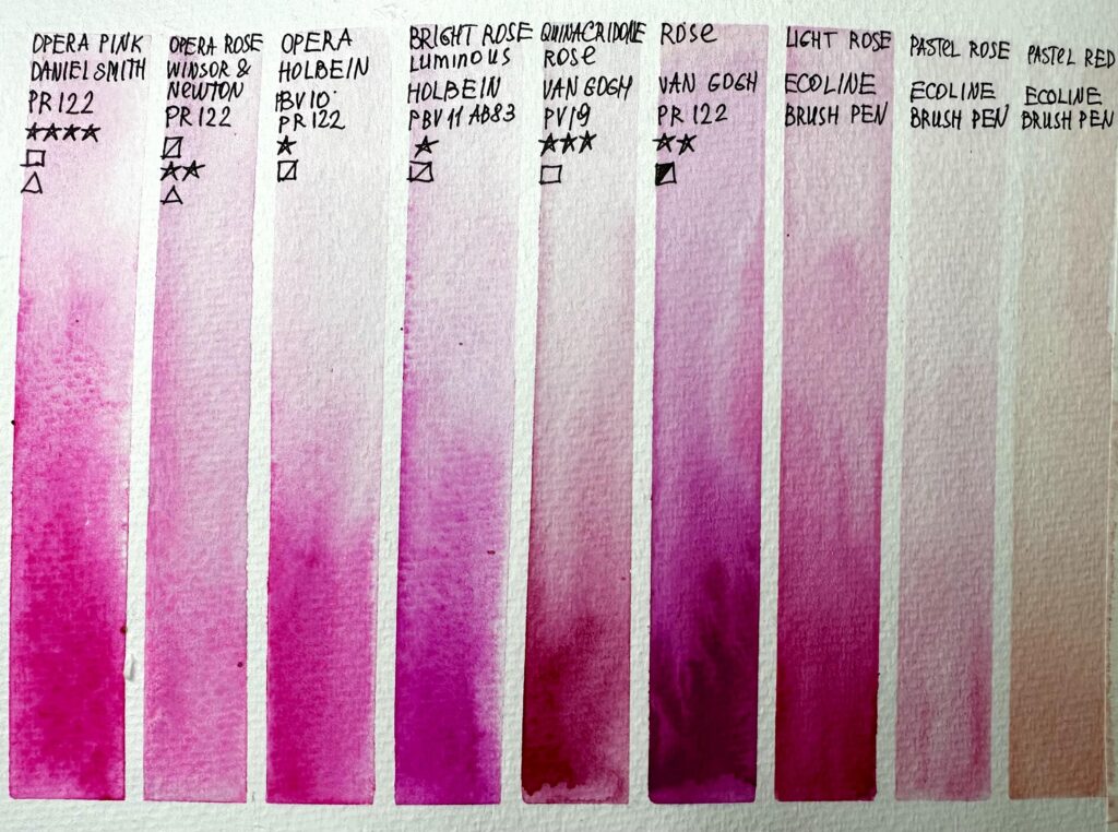
For COMPARISON CHART use all brands of the study colour from your collection, additionally you can compare any bright rusty colours that you have.
For creating the comparison chart the following paints were used:
- Opera Pink, Daniel Smith
- Opera Rose, Winsor&Newton
- Opera Rose, Holbein
- Bright Rose, Holbein
- Quinacridone Rose, Van Gogh
- Rose, Van Gogh
- Light Rose, ECOLINE brush pen
- Pastel Rose, ECOLINE brush pen
- Pastel Red ECOLINE brush pen
For the SKETCH Opera Rose, Orange, Red, Violet, Burnt Umber (Burnt Sienna), Quinoctidone Purple, Payne's Grey, Neutral Tint were used.
Also you will need white gouache. Alternatively you can use white acrylic marker, COPIC WHITE or BLEED PROOF WHITE by Dr PH Martins.

OVAS Paint Library Opera Rose Text OVAS Paint Library Page Layout 1 OVAS Paint Library Page Layout 2 OVAS Paint Library Page Layout 3
OVAS Paint Library Opera Rose 1 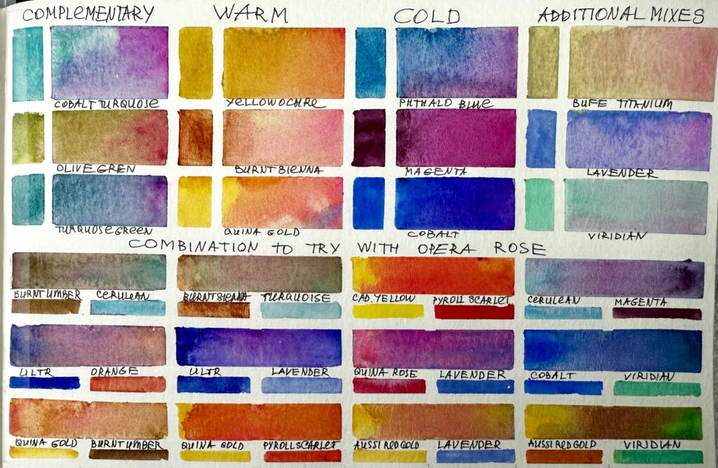
OVAS Paint Library Opera Rose 2
OVAS PL Opera rose 3
OVAs PL Opera Rose Sketch
Please watch the video(s) first, then take your time to practice the exercises; as many times as you wish.
When you’re satisfied, choose your best result and take a clear photo of your work. Try to photograph it in daylight with soft, diffused light to avoid harsh shadows.
Before uploading, crop the image so it shows only the painting; please don’t include mats, frames, or any background.
Finally, upload your result in the window below. Thank you and enjoy your painting!
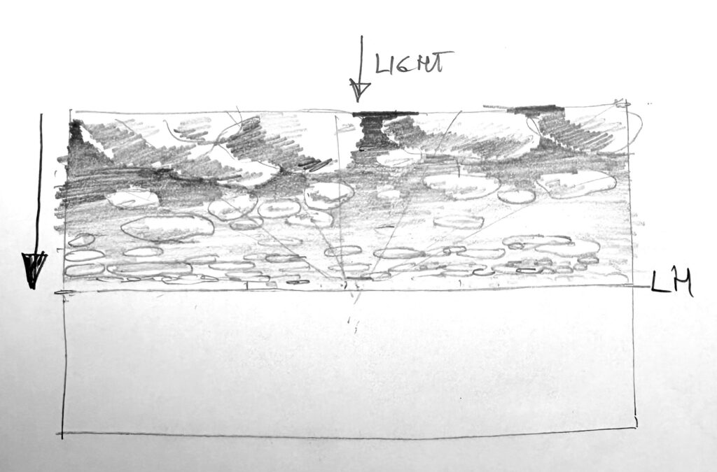
Part 3. Clouds study with pencil
We’ll start with observation – learning to read the rhythm, shape, and layering of clouds through pencil sketches. This exercise helps train your eye to see how size, contrast, and edges change with distance.
Materials used for the video demonstrations:

- Printer paper
- pencil
To print:
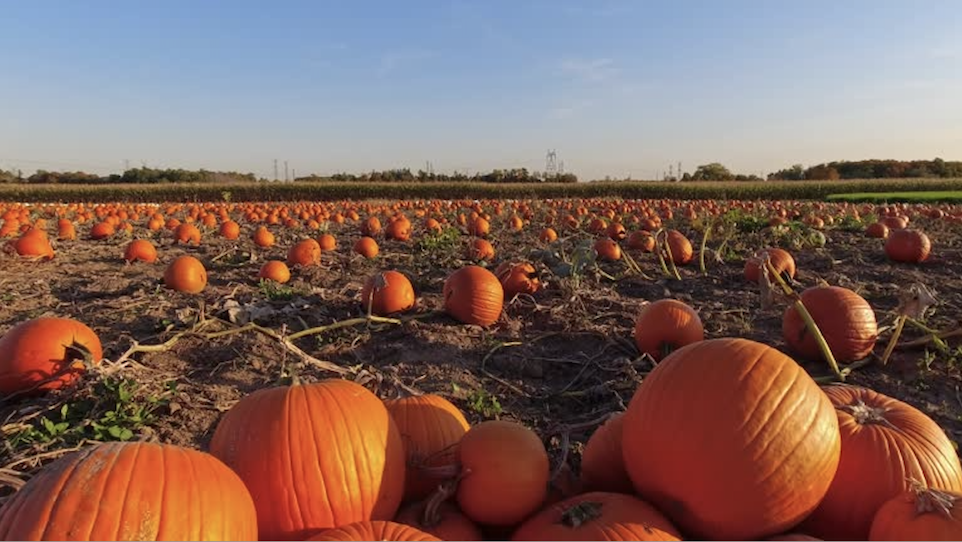
OVAS AL L5 Reference Pumpkins 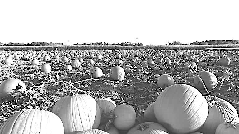
OVAS AL L5 Reference Pumpkins BW 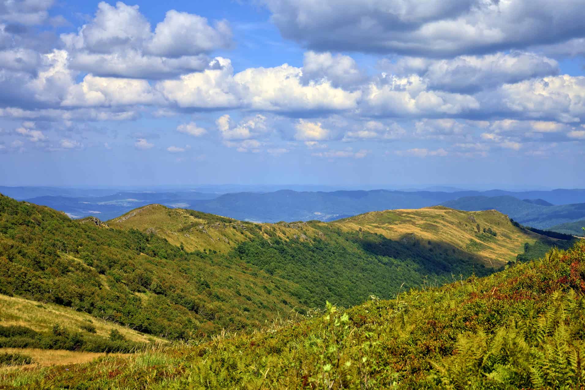
OVAS AL L5 Reference Clouds
Please watch the video(s) first, then take your time to practice the exercises; as many times as you wish.
When you’re satisfied, choose your best result and take a clear photo of your work. Try to photograph it in daylight with soft, diffused light to avoid harsh shadows.
Before uploading, crop the image so it shows only the painting; please don’t include mats, frames, or any background.
Finally, upload your result in the window below. Thank you and enjoy your painting!
Part 4. Clouds study with watercolour
Estimated time to complete this exercise:
from 20-30 minutes
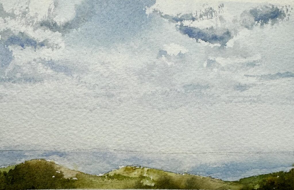
Materials used for the video demonstrations:

Watercolour paper Baohong, Rough, 100% cotton, size 6x4, you can use any size of paper

Artistic tape

Watercolour brush
- Flat brush, 3/8
- Mop brush, 10 mm, Paul Rubens size 6
- Calligraphy brush, 3 mm


Pencil, eraser,  paper towels, water, hair dryer

Watercolour paint:
Cerulean Blue
Ultramarine
Lavender
Neutral Tint
Sap Green
Yellow Ochre
Olive Green
Undersea Green
Please watch the video(s) first, then take your time to practice the exercises; as many times as you wish.
When you’re satisfied, choose your best result and take a clear photo of your work. Try to photograph it in daylight with soft, diffused light to avoid harsh shadows.
Before uploading, crop the image so it shows only the painting; please don’t include mats, frames, or any background.
Finally, upload your result in the window below. Thank you and enjoy your painting!
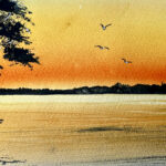
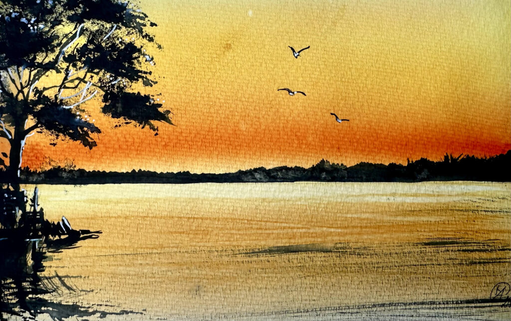
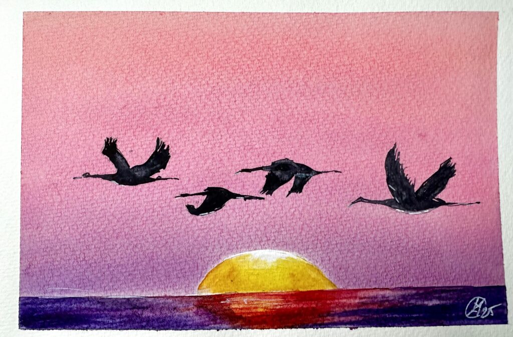
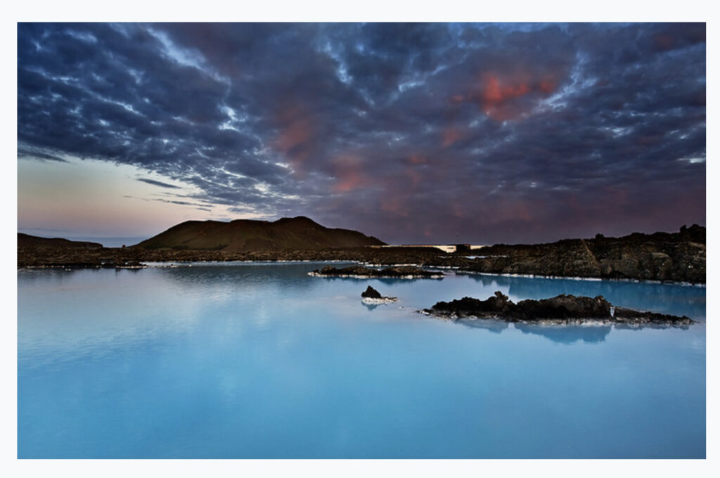
Part 5. Watercolour painting LAGUNA
Estimated time to complete this exercise:
Painting itself will take up to 2 hour
A serene composition where mountains meet water under a glowing sky. You’ll practice large, fluid washes, smooth gradients, and the infusion of colours that create a feeling of light within the painting – calm, expansive, and filled with air.
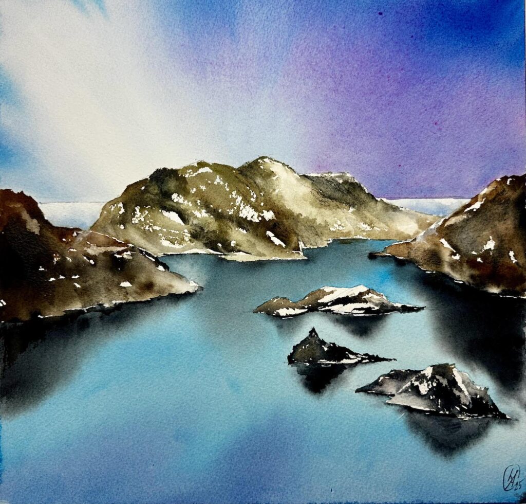
OVAS AL L5 Laguna
Materials used for the video demonstrations:

Watercolour paper
- Arches 100% cotton, Rough, 12 x 12 (30 x 30 cm)

Watercolour brush
- Flat brash, 1 1/2, Japan
- Flat brush, 3/4
- Mop brush, 10 mm, Paul Rubens size 6
- Calligraphy brush, 5 mm

Watercolour paint
- Cerulean Blue
- Payne's Grey
- Neutral Tint
- Burnt Umber
- Violet
- Opera rose
- Ultramarine
- Olive Green


White acrylic marker Uni POSCA,  alternatively use white gouache, COPIC WHITE or BLEED PROOF WHITE by Dr PH Martins.


Plexiglass board
Water Nano-mister spray
Water spray
Water
Paper towels
Hair dryer
To print:
OVAS AL L5 Reference Laguna 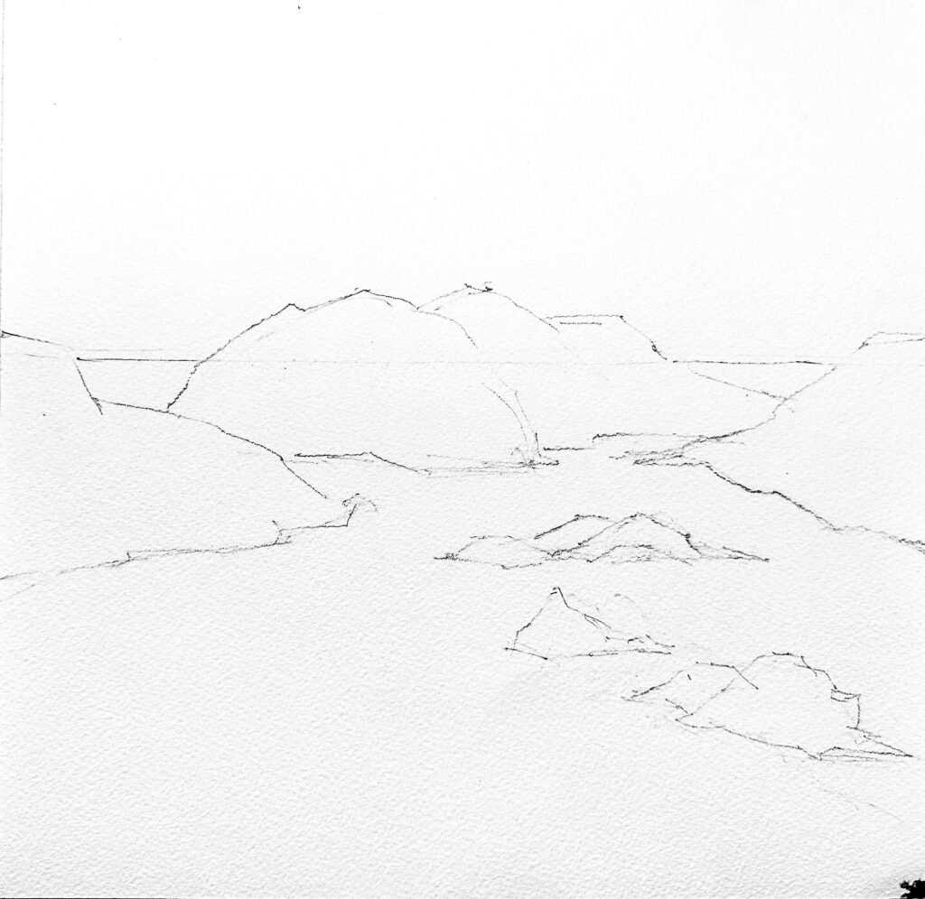
OVAS AL L5 Template Laguna 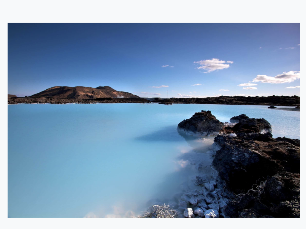
OVAS AL L5 Reference Homework
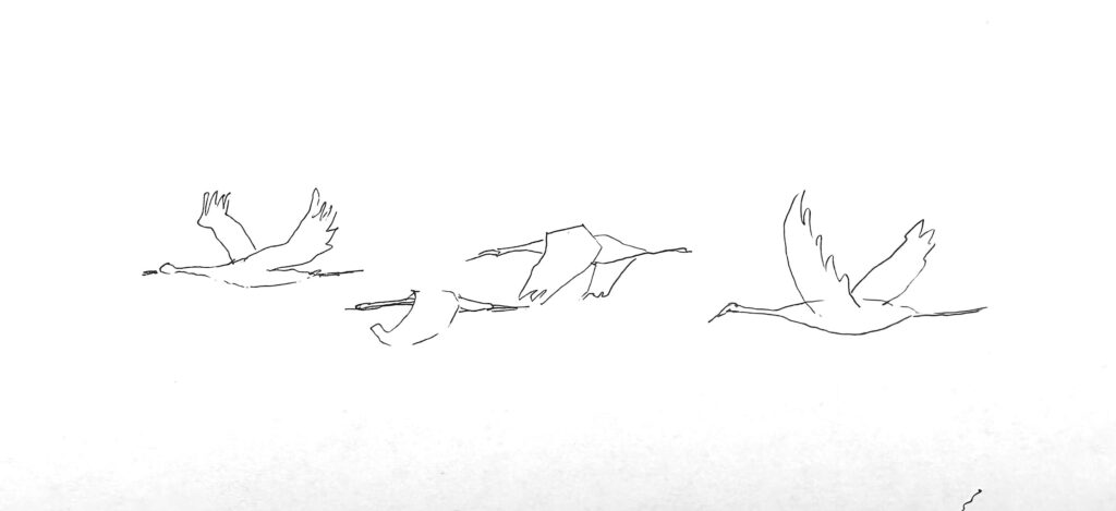
For this exercise, draw the pencil sketch using the photo reference, or use the template provided above to transfer it onto your paper.
Please watch the video(s) first, then take your time to practice the exercises; as many times as you wish.
When you’re satisfied, choose your best result and take a clear photo of your work. Try to photograph it in daylight with soft, diffused light to avoid harsh shadows.
Before uploading, crop the image so it shows only the painting; please don’t include mats, frames, or any background.
Finally, upload your result in the window below. Thank you and enjoy your painting!
Student’s work
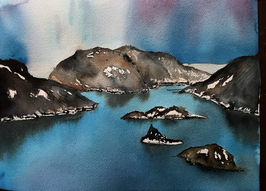
Sue 2025 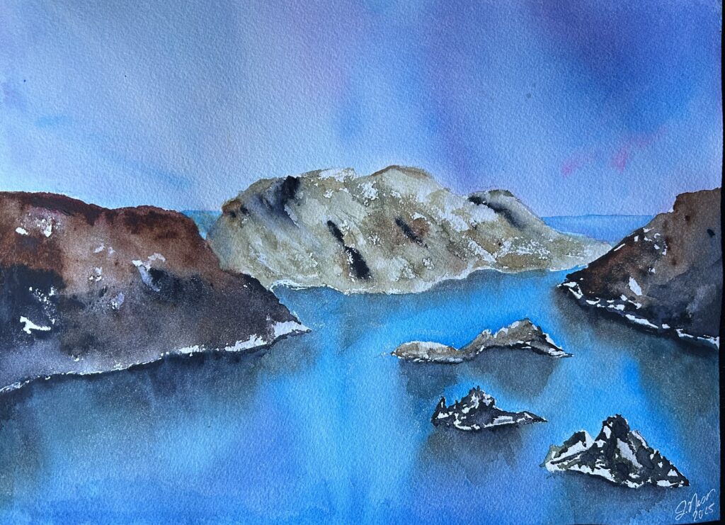
Jennifer 2025 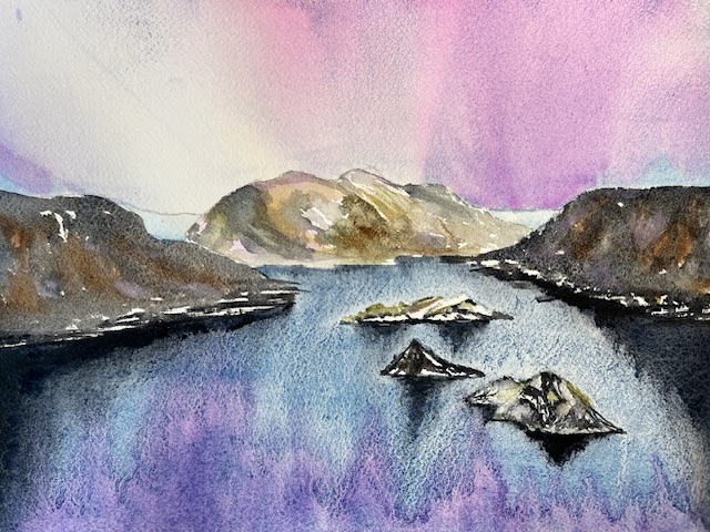
Laura 2025 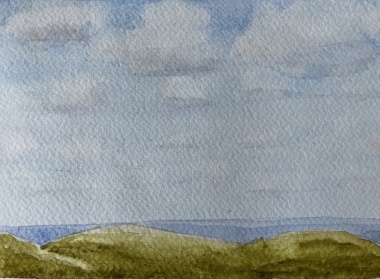
Laura 2025 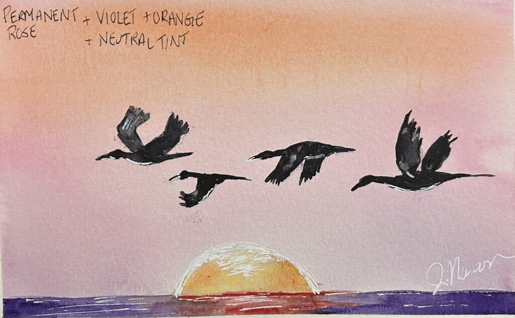
Jennifer 2025 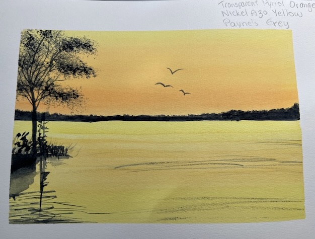
Laura 2025