Lesson 6. Village
In the last lesson of this course we combine colour knowledge, bird studies, and compositional atmosphere to paint a misty village scene.
You’ll deepen your Paint Library studies with Madder Lake and Carmine and practice realistic birds in flight (pencil, monochrome, and colour).
The main project, Village, teaches controlled mist, soft gradients, and how to balance warm foregrounds with cool, distant architecture for convincing depth.
Carmine 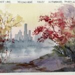
Madder Lake 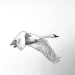
Swan Pencil 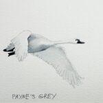
Swan Mono 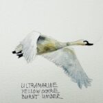
Swan Colour 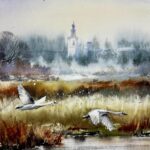
Village
Use these buttons to navigate the lesson content
Please use this navigation button to jump directly to the homework upload section at the bottom of the lesson page
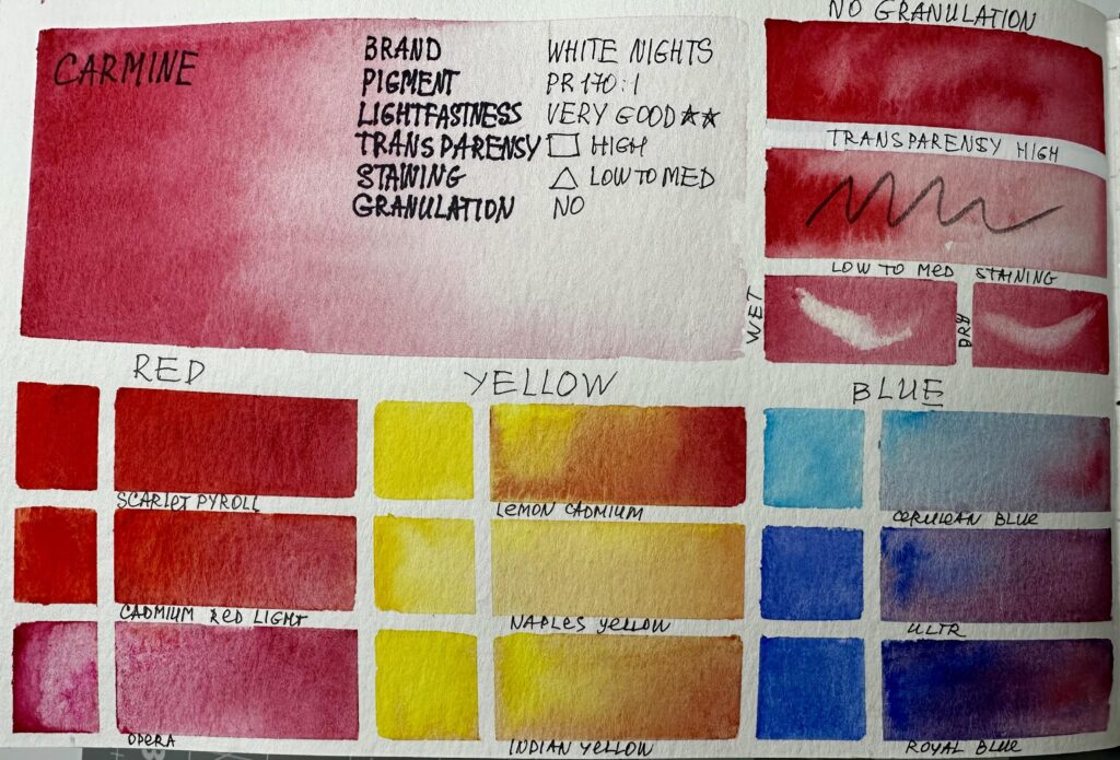
Part 1. Paint Library CARMINE
Take your time and enjoy the process, this exercise is about discovery, not perfection. Think of this as play, not work, let curiosity guide you, and allow yourself to be surprised by the beautiful mixes that appear on your page.
Please, click on the button to watch videos and read about the Paint Library System before you start the first exercise
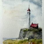
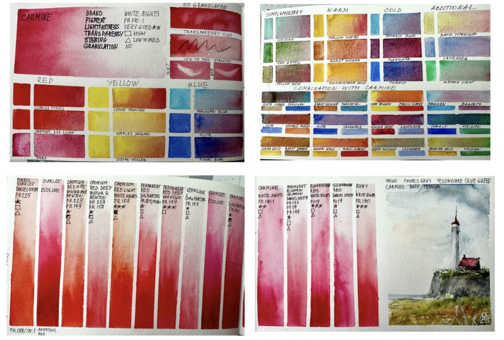
Study Carmine’s colour character and mixing behavior. Create mixing charts and a Lighthouse colour sketch showing its translucency, intensity, and how it cools or warms depending on mix and layering.
Estimated time to complete this exercise:
Creating the mixing charts will take about 1 to 1.5 hours, plus an additional 45 minutes for the sketch.
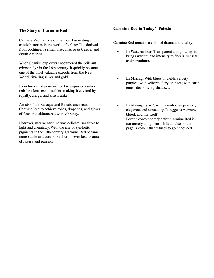
The Story of Carmine Red
Carmine Red has one of the most fascinating and exotic histories in the world of colour. It is derived from cochineal, a small insect native to Central and South America.
When Spanish explorers encountered the brilliant crimson dye in the 16th century, it quickly became one of the most valuable exports from the New World, rivalling silver and gold.
Its richness and permanence far surpassed earlier reds like kermes or madder, making it coveted by royalty, clergy, and artists alike.
Artists of the Baroque and Renaissance used Carmine Red to achieve robes, draperies, and glows of flesh that shimmered with vibrancy.
However, natural carmine was delicate; sensitive to light and chemistry. With the rise of synthetic pigments in the 19th century, Carmine Red became more stable and accessible, but it never lost its aura of luxury and passion.
Carmine Red in Today’s Palette
Carmine Red remains a color of drama and vitality.
- In Watercolour: Transparent and glowing, it brings warmth and intensity to florals, sunsets, and portraiture.
- In Mixing: With blues, it yields velvety purples; with yellows, fiery oranges; with earth tones, deep, living shadows.
- In Atmosphere: Carmine embodies passion, elegance, and sensuality. It suggests warmth, blood, and life itself.
For the contemporary artist, Carmine Red is not merely a pigment—it is a pulse on the page, a colour that refuses to go unnoticed.
Materials used for the video demonstrations:
Watercolour Art Journal, Strathmore, 8.5 x 5.5, paper 140 g
Artistic tape, 3mm and 5 mm
Watercolour brush
- Flat brush, 1 1/2, Japan
- Mop brush, 10 mm, Paul Rubens size 6
- Calligraphy brush, 3 mm
Pencil, eraser, paper towels, water, hair dryer
Watercolour paint:
Colour to study: Carmine, White Night
For RED block you can use any three red colours from your collection. For the video demonstration Payroll Scarlet, Cadmium Red Light and Opera Rose
For YELLOW block you can use any three yellow colours from your collection. For the video demonstration Lemon Yellow, Naples Yellow and Indian Yellow were used.
For BLUE block you can use any three blue colours from your collection. For the video demonstration Cerulean Blue, Ultramarine and Royal Blue were used.
For COMPLEMENTARY block you can use any greenish colours from your collection. For the video demonstration Viridian, Sap Green and Yellow Duskwere used.
For WARM block you can use any three warm-yellow-redish-brownish colours from your collection. For the video demonstration Yellow Ochre, Burnt Sienna and Quinacridone Gold were used.
For COLD block you can use any three cold-bluish colours from your collection. For the video demonstration Phthalo Blue, Magenta and Cobalt were used.
For ADDITIONAL MIXES block you can use any three colours from your collection. For the video demonstration Buff Titanium, Lavender and Green Light were used.
For COMBINATIONS TO TRY WITH THE STUDY COLOUR block you can use any colours from your collection. Please choose any two colours, mix them and add the study colour. For the video demonstration Burnt Umber, Cerulean, Ultramarine, Orange Transparent, Quinacridone Gold, Burnt Sienna, Cobalt Turquoise, Lavender, Payroll Scarlet, Cadmium yellow, Magenta, Quinacridone Rose, Aussi Red Gold, Cobalt and Viridian were used.
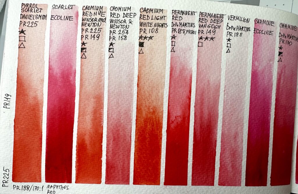
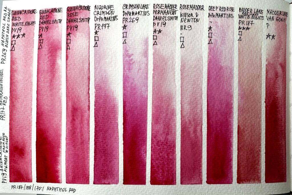
For COMPARISON CHART use all brands of the study colour from your collection, additionally you can compare any deep-rose-red colours that you have.
For creating the comparison chart the following paints were used:
- Payroll Scarlet, Daniel Smith
- Scarlet, ECOLINE brush pen
- Cadmium Red Hue, Winsor&Newton
- Cadmium Red Deep, Winsor&Newton
- Cadmium Red Light, Winsor&Newton
- Permanent Red, Dr Ph Martins
- Permanent Red Deep, Van Gogh
- Vermilion, Dr Ph Martins
- Carmine, ECOLINE brush pen
- Carmine, Dr Ph Martins
- Carmine, White Nights
- Permanent Alizarin Crimson, Daniel Smith
- Quinacridone Red, White Nights
- Quinacridone Red, Daniel Smith
- Ruby, White Nights
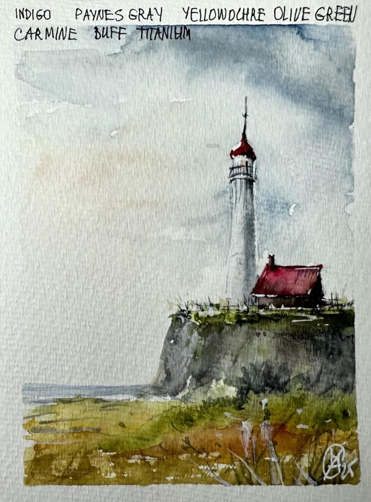
For SKETCH Carmine, Indigo, Yellow Ochre, Olive Green, Buff Titanium and Payne's Grey were used.
Also you will need white gouache. Alternatively you can use white acrylic marker, COPIC WHITE or BLEED PROOF WHITE by Dr PH Martins.
To print:
Please transfer the selected layout onto your watercolour paper (journal) by using pencil or artistic tape.
Please print “OVAS PL Orange Text“, fold it in half and trim the paper to fit the size of your art journal (format A5) or leave it as is if you use A4 format. Use clear tape to attach it to the journal.

OVAS PL Carmine Text 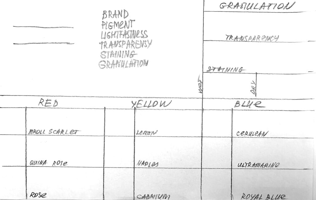
OVAS Paint Library Page Layout 1 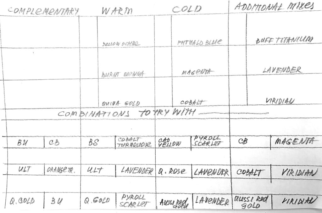
OVAS Paint Library Page Layout 2 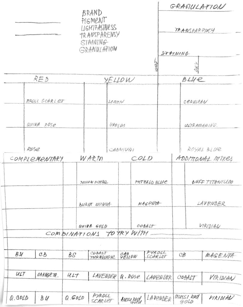
OVAS Paint Library Page Layout 3
Please watch this video first, and then repeat after me or create your own mixing chart to create Blocks/Pages 1 and 2 for your Paint Library.
PL Carmine 1 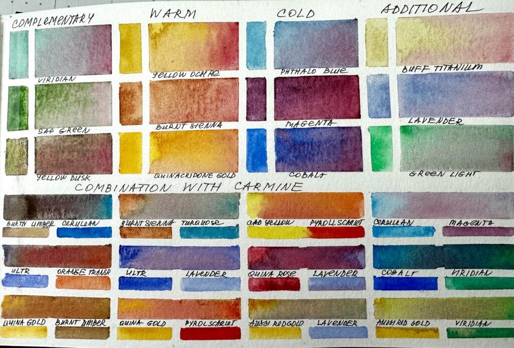
PL Carmine 2
To create the comparison chart for Block/Page 3 of your Paint Library, simply divide the page into vertical columns, covering the top and bottom rows with tape. When applying paint, build a smooth gradation—dark at the bottom, fading to light at the top. The lighter section of each colour column will provide space for you to note down the characteristics of that paint.
Over time, you can expand your comparison chart by adding “similar” paints. This is a great way to explore your collection more deeply and discover subtle differences between brands or hues
PL Carmine 3-1 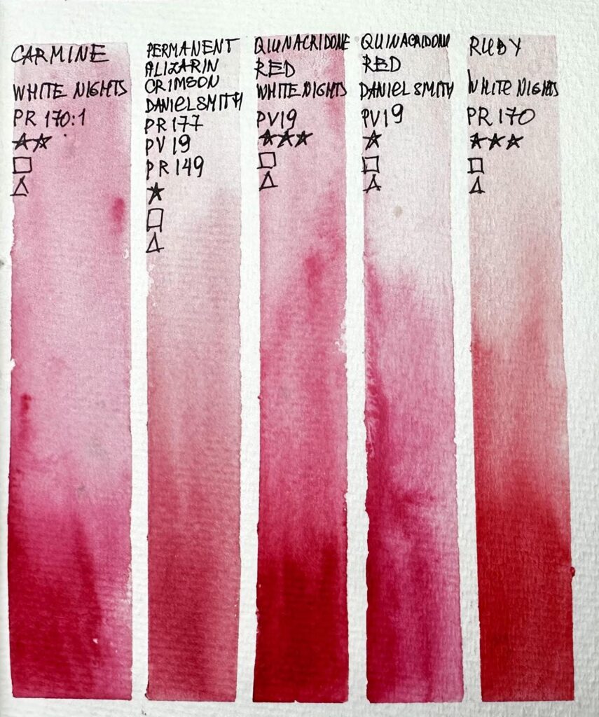
PL Carmine 3-2
In Block/Page 4 of your Paint Library, we will practice sketching with the colour – Carmine. You will use an additional colours: Indigo, Yellow Ochre, Olive Green, Buff Titanium and Payne’s Grey were used.
OVAs PL Carmine Sketch
Please watch the video(s) first, then take your time to practice the exercises; as many times as you wish.
When you’re satisfied, choose your best result and take a clear photo of your work. Try to photograph it in daylight with soft, diffused light to avoid harsh shadows.
Before uploading, crop the image so it shows only the painting; please don’t include mats, frames, or any background.
Finally, upload your result in the window below. Thank you and enjoy your painting!
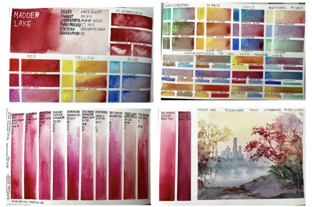
Explore Madder Lake’s warm, transparent red creating mix charts and sketching a beautiful Fall Cityscape scene. Learn its subtle tonal range and how it behaves in glazes and atmospheric effects.
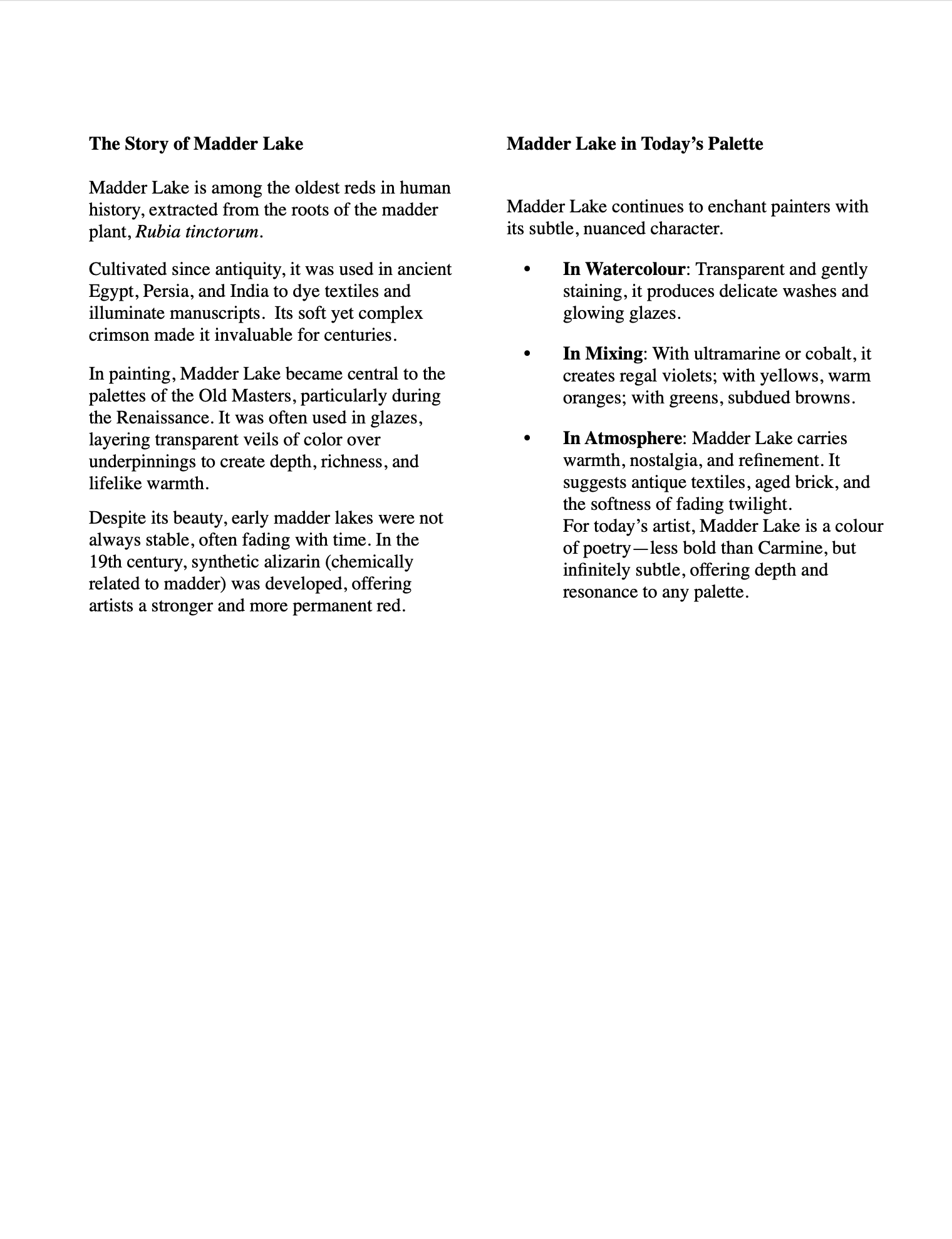
The Story of Madder Lake
Madder Lake is among the oldest reds in human history, extracted from the roots of the madder plant, Rubia tinctorum.
Cultivated since antiquity, it was used in ancient Egypt, Persia, and India to dye textiles and illuminate manuscripts. Its soft yet complex crimson made it invaluable for centuries.
In painting, Madder Lake became central to the palettes of the Old Masters, particularly during the Renaissance. It was often used in glazes, layering transparent veils of color over underpinnings to create depth, richness, and lifelike warmth.
Despite its beauty, early madder lakes were not always stable, often fading with time. In the 19th century, synthetic alizarin (chemically related to madder) was developed, offering artists a stronger and more permanent red.
Madder Lake in Today’s Palette
Madder Lake continues to enchant painters with its subtle, nuanced character.
- In Watercolour: Transparent and gently staining, it produces delicate washes and glowing glazes.
- In Mixing: With ultramarine or cobalt, it creates regal violets; with yellows, warm oranges; with greens, subdued browns.
- In Atmosphere: Madder Lake carries warmth, nostalgia, and refinement. It suggests antique textiles, aged brick, and the softness of fading twilight.
For today’s artist, Madder Lake is a colour of poetry—less bold than Carmine, but infinitely subtle, offering depth and resonance to any palette.
Materials used for the video demonstrations:
Watercolour Art Journal, Strathmore, 8.5 x 5.5, paper 140 g
Artistic tape, 3mm and 5 mm
Watercolour brush
- Flat brush, 1 1/2, Japan
- Mop brush, 10 mm, Paul Rubens size 6
- Calligraphy brush, 3 mm
Pencil, eraser, paper towels, water, hair dryer, kitchen sponge
Watercolour paint:
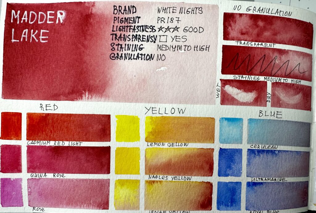
Colour to study: Madder Lake, White Nights
For RED block you can use any three red colours from your collection. For the video demonstration Cadmium Red Light, Quinacridone Rose and Rose
For YELLOW block you can use any three yellow colours from your collection. For the video demonstration Lemon Yellow, Naples Yellow and Indian Yellow were used.
For BLUE block you can use any three blue colours from your collection. For the video demonstration Cerulean Blue, Ultramarine and Royal Blue were used.
For COMPLEMENTARY block you can use any greenish colours from your collection. For the video demonstration Green Light, Sap Green and Undersea Green were used.
For WARM block you can use any three warm-yellow-redish-brownish colours from your collection. For the video demonstration Yellow Ochre, Burnt Sienna and Quinacridone Gold were used.
For COLD block you can use any three cold-bluish colours from your collection. For the video demonstration Phthallo Blue, Cobalt and Magenta were used.
For ADDITIONAL MIXES block you can use any three colours from your collection. For the video demonstration Buff Titanium, Lavender and Viridian were used.
For COMBINATIONS TO TRY WITH STUDY COLOUR block you can use any colours from your collection. Please choose any two colours, mix them and add the study colour. For the video demonstration Burnt Umber, Cerulean, Ultramarine, Orange, Quinacridone Gold, Burnt Sienna, Turquoise Green, Lavender, Aussie Red Gold, Payroll Scarlet, Cadmium Yellow, Quinacridone Rose, Magenta, Cobalt and Viridian were used.
For COMPARISON CHART use all brands of the study colour from your collection, additionally you can compare any bright rusty colours that you have.
For creating the comparison chart the following paints were used:
- Quinacridone red, White Nights
- Quinacridone Red, Daniel Smith
- Quinacridone Rose, Daniel Smith
- Alizarine Crimson, Dr Ph Martins
- Rose Madder Permanent, Daniel Smith
- Rose Madder, Winsor&Newton
- Deep Red Rose, Dr Ph Martins
- Madder Lake, White Nights
- Madder Lake, Van Gogh
- Red Brown, ECOLINE brush pen
- Mahogany, ECOLINE brush pen
For the SKETCH Madder Lake, Yellow Ochre, Violet, Olive Green, Ultramarine and Payne's Grey were used.
Also you will need white gouache. Alternatively you can use white acrylic marker, COPIC WHITE or BLEED PROOF WHITE by Dr PH Martins.

OVAS PL Madder Lake Text OVAS Paint Library Page Layout 1 OVAS Paint Library Page Layout 2 OVAS Paint Library Page Layout 3
OVAS PL Madder lake 1 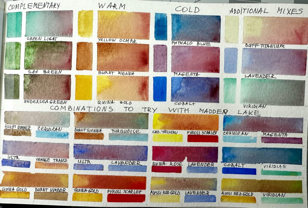
OVAS PL Madder lake 2
OVAS PL Madder lake 3-1 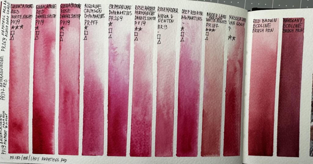
OVAS PL Madder lake 3-2
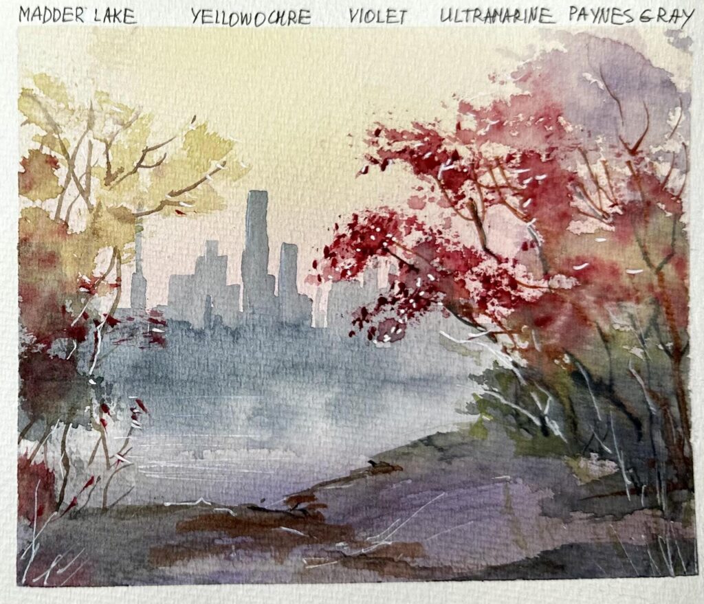
OVAS PL Madder Lake Sketch
Please watch the video(s) first, then take your time to practice the exercises; as many times as you wish.
When you’re satisfied, choose your best result and take a clear photo of your work. Try to photograph it in daylight with soft, diffused light to avoid harsh shadows.
Before uploading, crop the image so it shows only the painting; please don’t include mats, frames, or any background.
Finally, upload your result in the window below. Thank you and enjoy your painting!
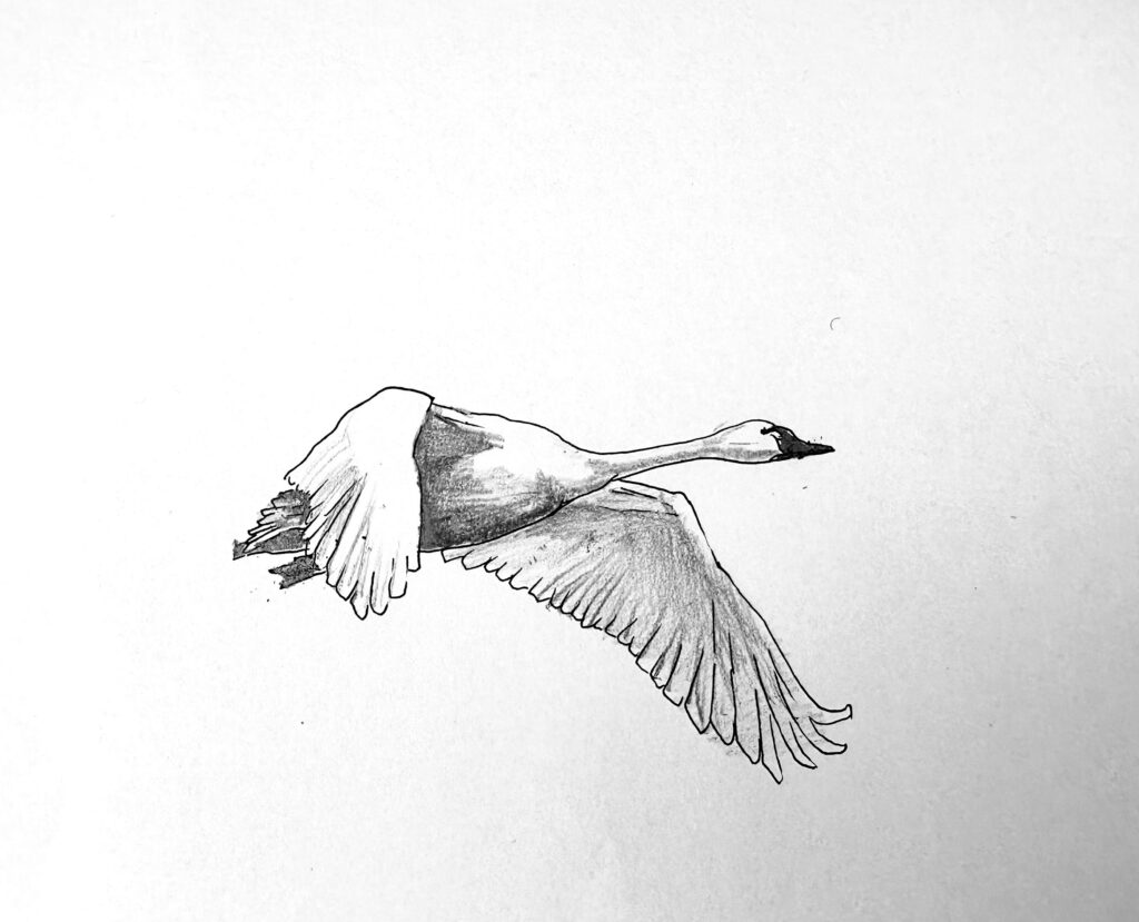
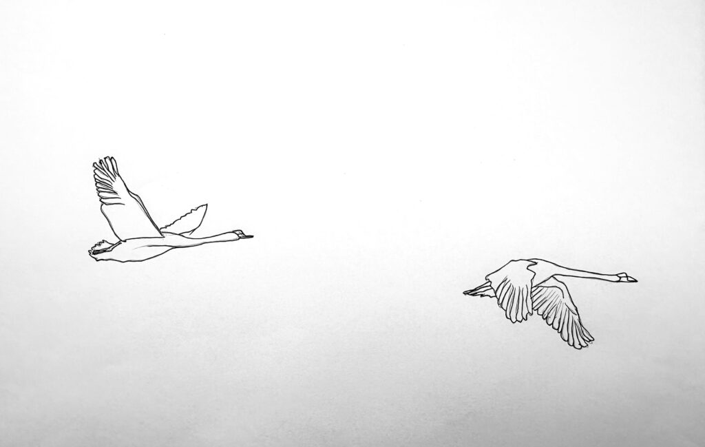
Part 3. Swan study with pencil
We’ll start with observation – learning to tonal values of a bird body by colouring the template with pencil.
Materials used for the video demonstrations:

- Printer template "Swan"
- pencil
To print:
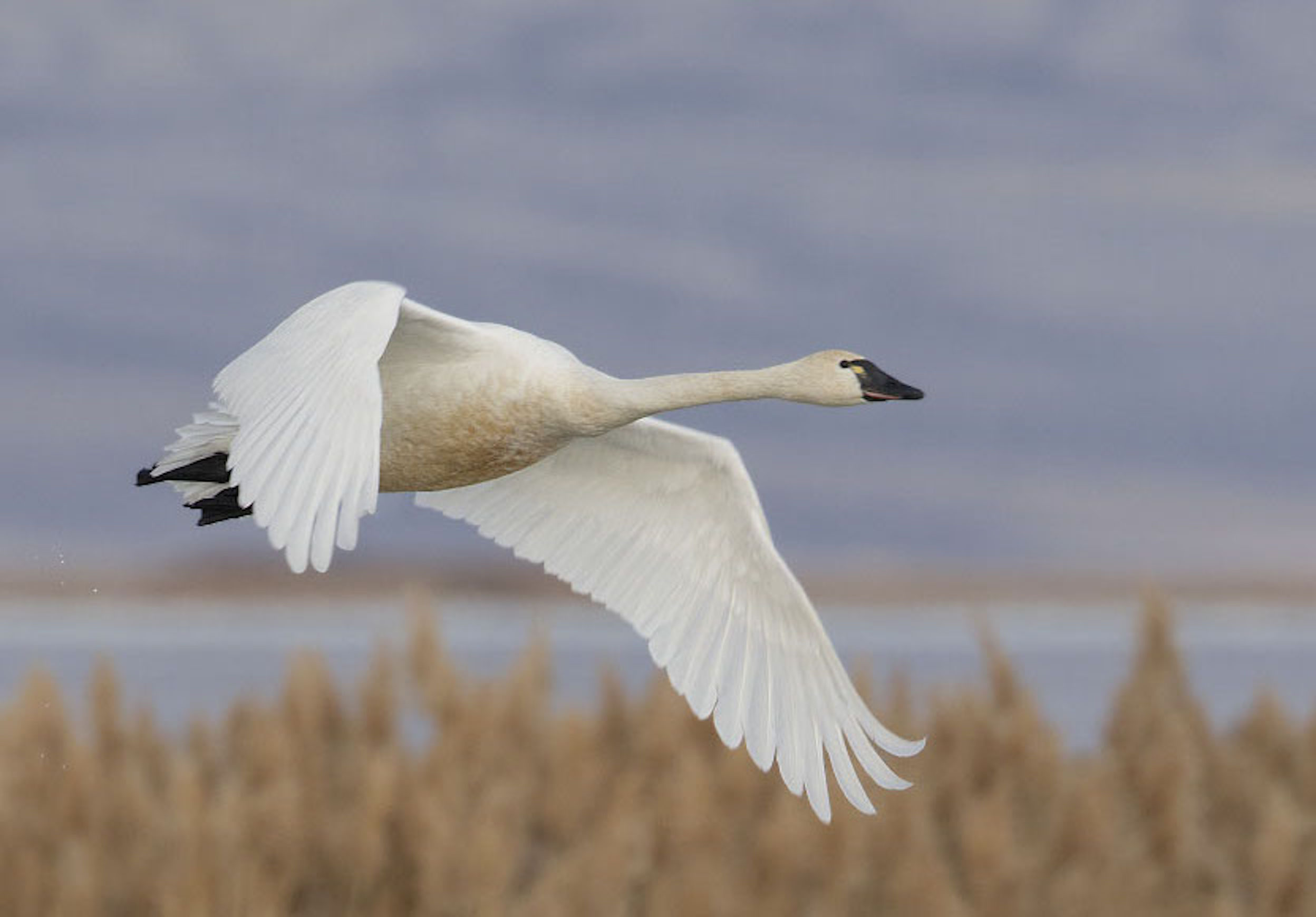
OVAS AL L6 Reference Swan 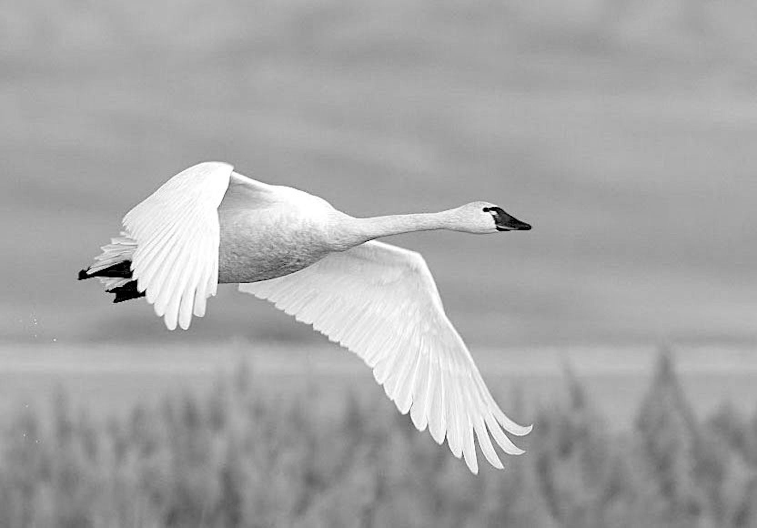
OVAS AL L6 Reference Swan BW 
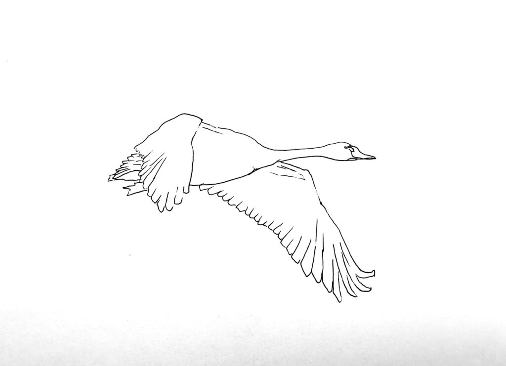
OVAS AL L6 Template Swan
Please watch the video(s) first, then take your time to practice the exercises; as many times as you wish.
When you’re satisfied, choose your best result and take a clear photo of your work. Try to photograph it in daylight with soft, diffused light to avoid harsh shadows.
Before uploading, crop the image so it shows only the painting; please don’t include mats, frames, or any background.
Finally, upload your result in the window below. Thank you and enjoy your painting!
Part 4. Swan study with monochromatic watercolour
Estimated time to complete this exercise:
from 15-20 minutes
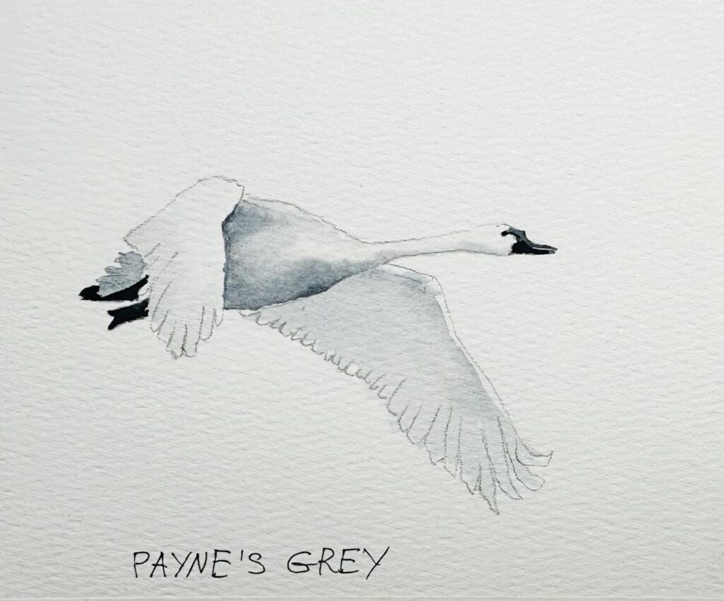
Materials used for the video demonstrations:

Watercolour paper Baohong, Rough, 100% cotton, size 7,5 x 5, you can use any size of paper

Artistic tape

Watercolour brush
- Flat brush, 3/8
- Mop brush, 10 mm, Paul Rubens size 6
- Calligraphy brush, 3 mm


Pencil, eraser,  paper towels, water, hair dryer

Watercolour paint:
Payne's Grey
Please watch the video(s) first, then take your time to practice the exercises; as many times as you wish.
When you’re satisfied, choose your best result and take a clear photo of your work. Try to photograph it in daylight with soft, diffused light to avoid harsh shadows.
Before uploading, crop the image so it shows only the painting; please don’t include mats, frames, or any background.
Finally, upload your result in the window below. Thank you and enjoy your painting!
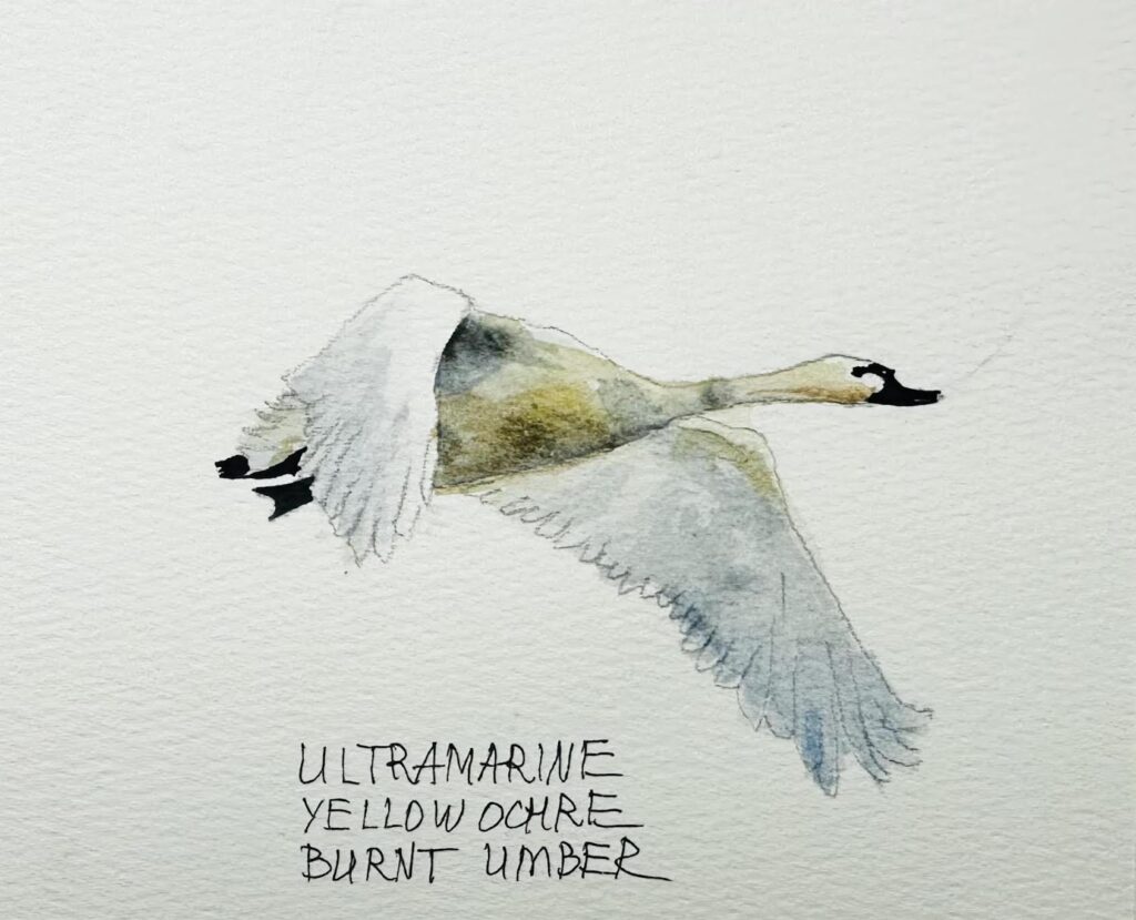
Materials used for the video demonstrations:

Watercolour paper Baohong, Rough, 100% cotton, size 7,5 x 5, you can use any size of paper

Artistic tape

Watercolour brush
- Flat brush, 3/8
- Mop brush, 10 mm, Paul Rubens size 6
- Calligraphy brush, 3 mm


Pencil, eraser,  paper towels, water, hair dryer

Watercolour paint:
Payne's Grey
Ultramarine
Yellow Ochre
Burnt Umber
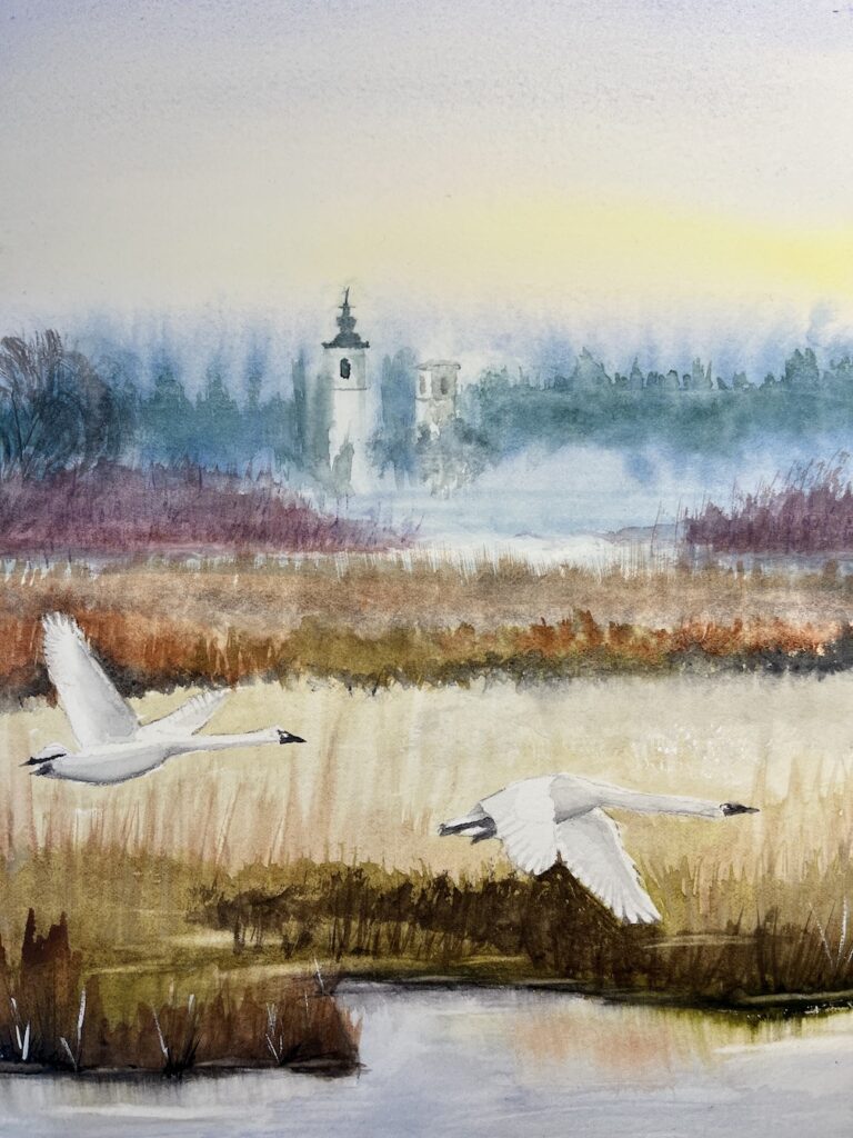
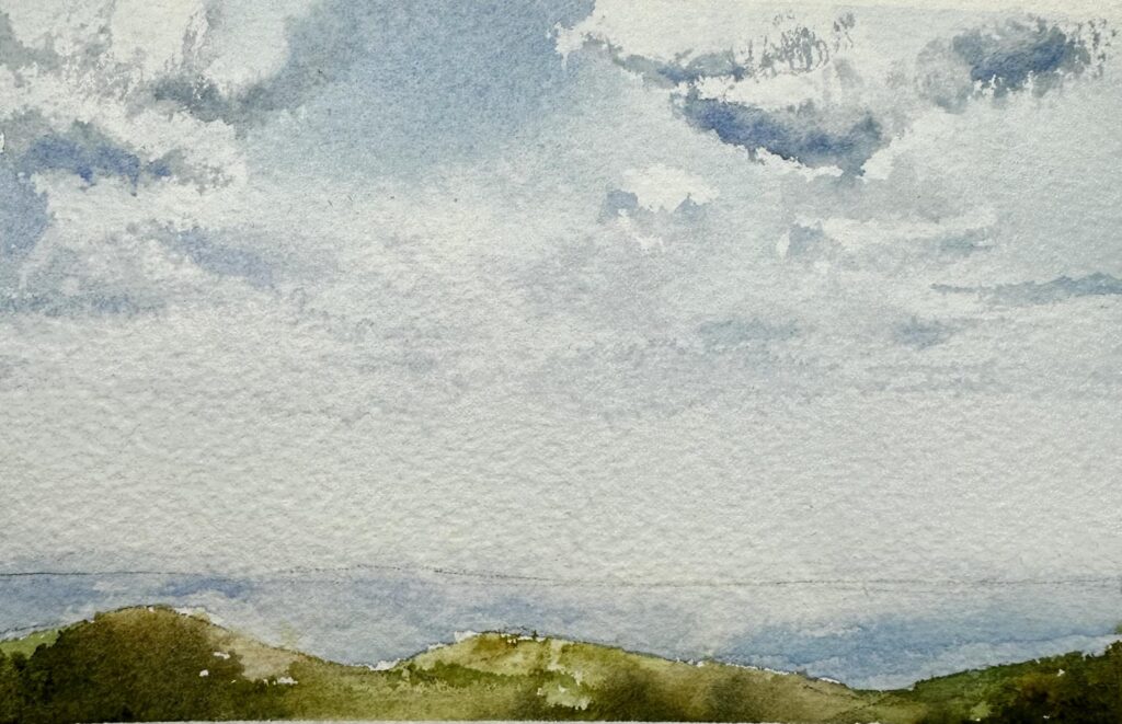
Part 6. Watercolour painting VILLAGE
Estimated time to complete this exercise:
Painting itself will take up to 1.5 to 2 hour
Combine mist techniques, soft gradients, bird studies, and architectural shapes to paint a village landscape. Focus on atmospheric depth: warm, textured foregrounds against cool, lost distant structures, finished with birds to bring life and scale.
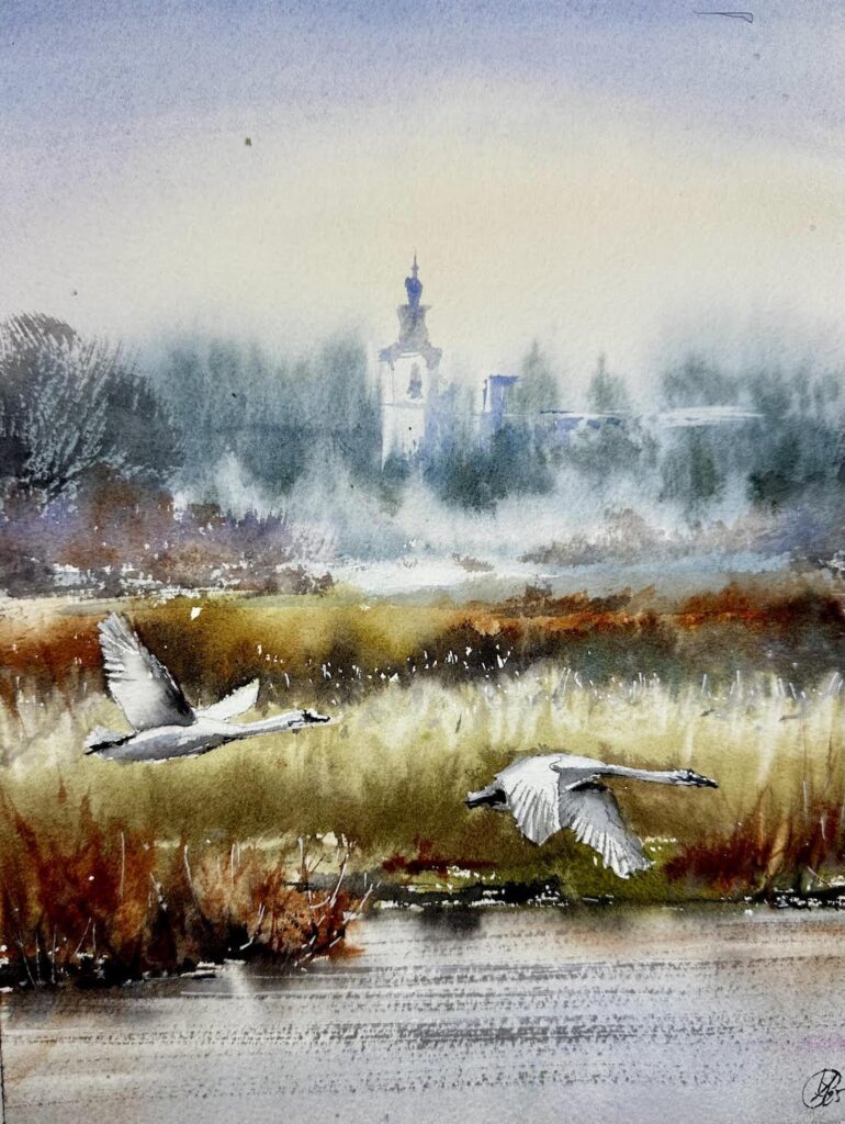
OVAS AP L6 Village
Materials used for the video demonstrations:

Watercolour paper
- Arches 100% cotton, Rough, 9 x 12 (23 x 30 cm)

Watercolour brush
- Flat brash, 1 1/2, Japan
- Flat brush, 3/4
- Mop brush, 10 mm, Paul Rubens size 6
- Calligraphy brush, 5 mm

Watercolour paint
- Yellow
- Orange
- Lavender
- Opera Rose (Pink)
- Ultramarine
- Pyrelene Green (Prussian Blue)
- Buff Titanium
- Burnt Umber
- Olive Green
- Gold Green
- Neutral Tint
- Turquoise (optional)
- Burnt Sienna
- Magenta


White acrylic marker Uni POSCA,  alternatively use white gouache, COPIC WHITE or BLEED PROOF WHITE by Dr PH Martins.


Plexiglass board
Water Nano-mister spray
Water spray
Water
Paper towels
Hair dryer
Kitchen sponge
To print:
OVAS AP L6 Village 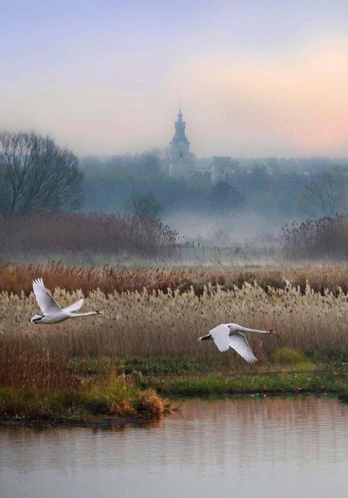
OVAS AL L6 Reference Village 
OVAS AL L6 Reference Village Homework
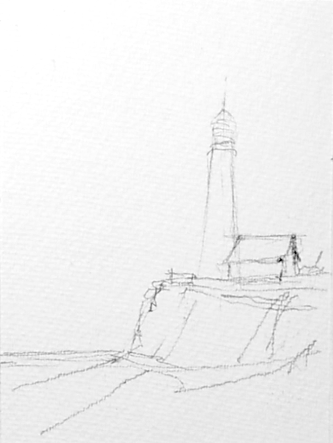
For this exercise, draw the pencil sketch using the photo reference, or use the template provided above to transfer it onto your paper.
Please watch the video(s) first, then take your time to practice the exercises; as many times as you wish.
When you’re satisfied, choose your best result and take a clear photo of your work. Try to photograph it in daylight with soft, diffused light to avoid harsh shadows.
Before uploading, crop the image so it shows only the painting; please don’t include mats, frames, or any background.
Finally, upload your result in the window below. Thank you and enjoy your painting!
Student’s work
Laura 2025 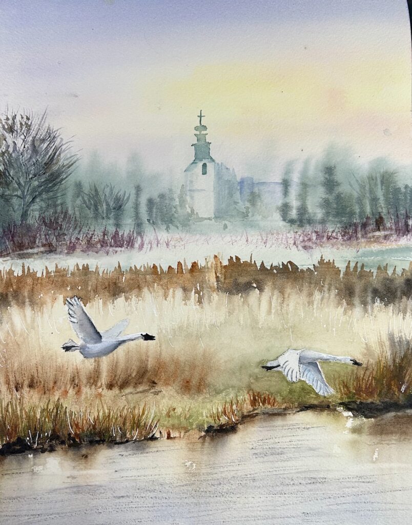
Jennifer 2025 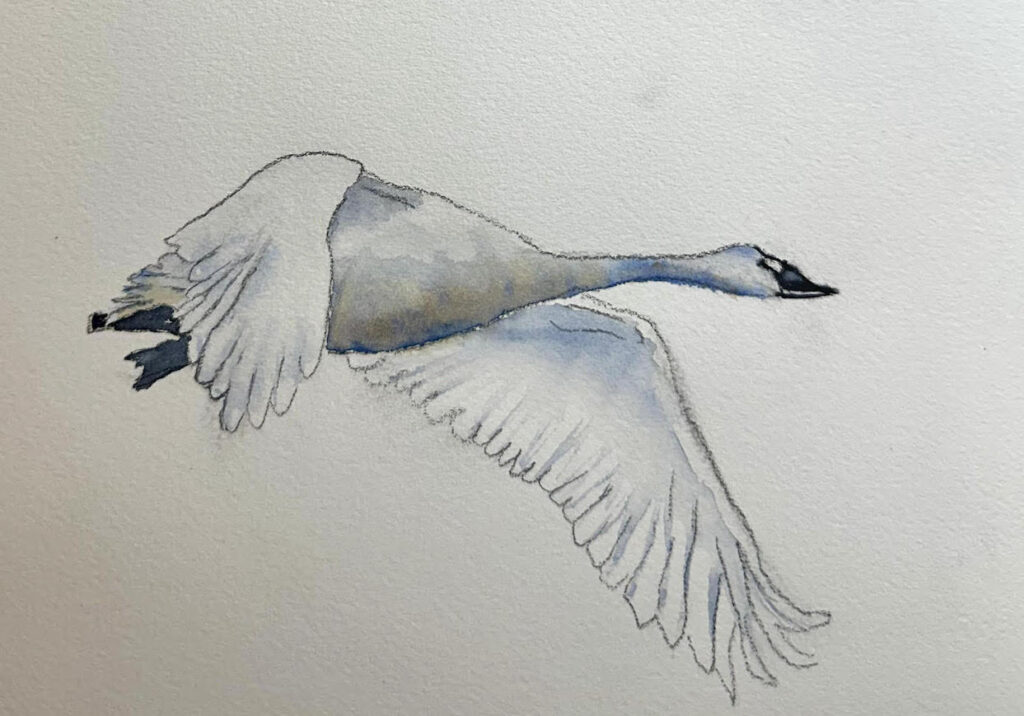
Sue 2025 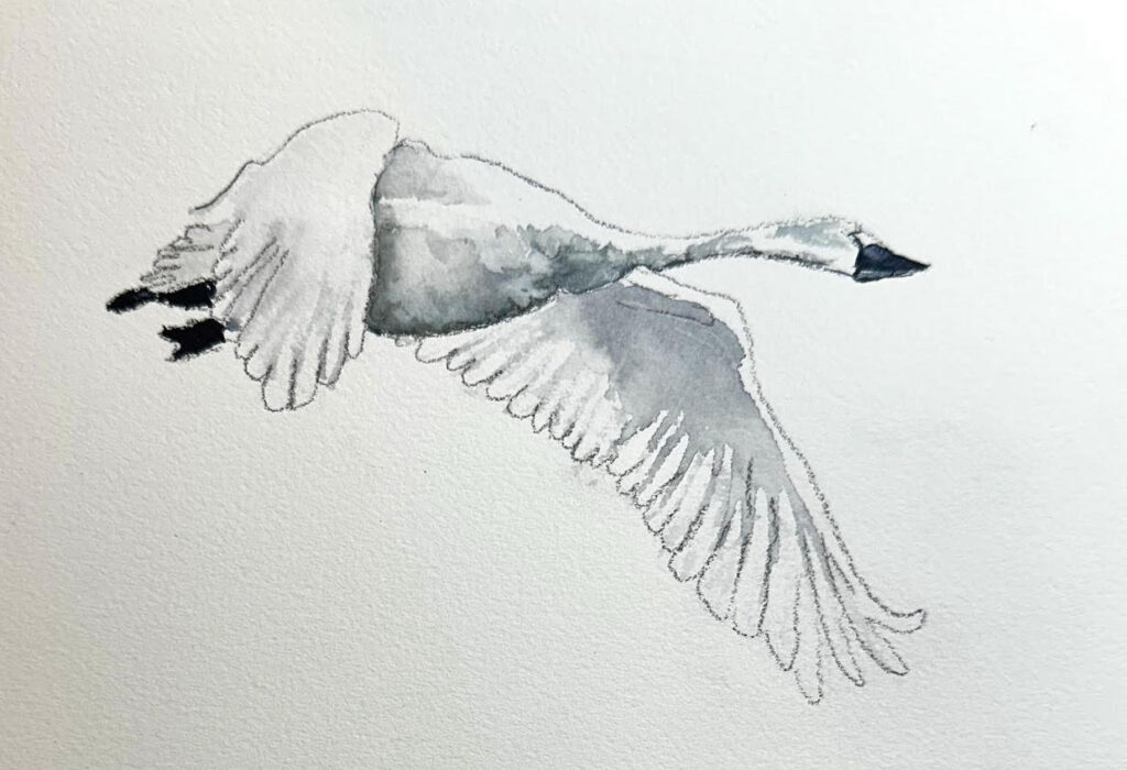
Sue 2025 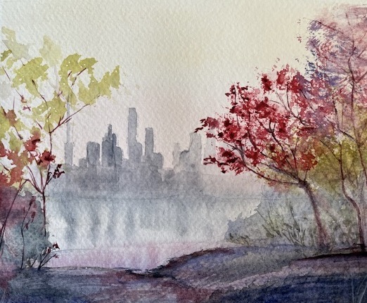
Laura 2025 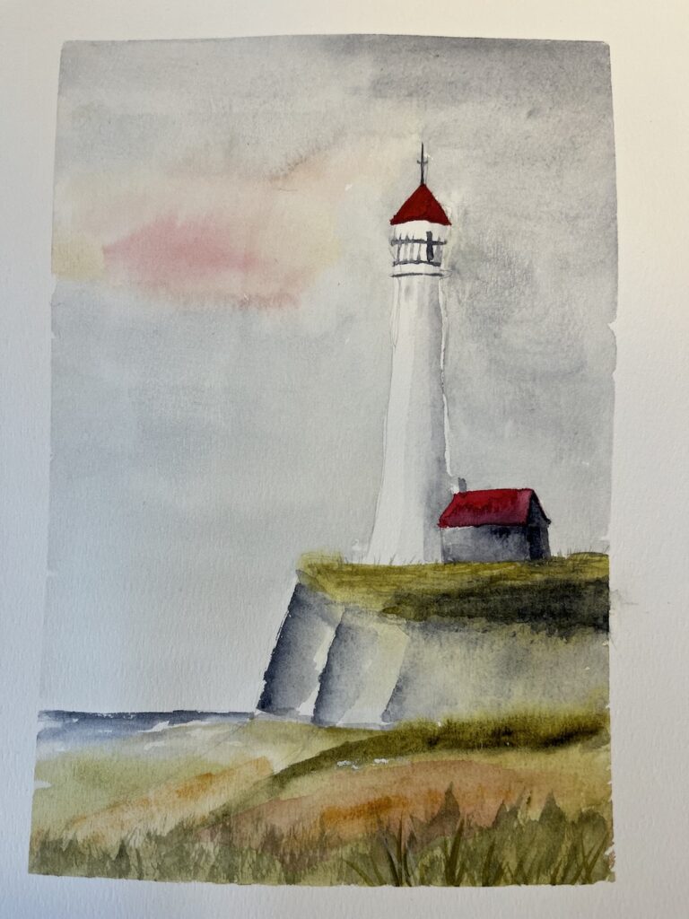
Thank you all for your support!
I’ve truly enjoyed our time together exploring the beautiful magic of watercolour. I hope you’ve found our sessions inspiring and discovered how wonderfully expressive and delightfully unpredictable watercolour can be.
As we reach the final class of this course, you now have a few weeks before the end of the year to continue practicing and revisiting any of the paintings from this series. Feel free to paint and experiment as many times as you like! When you’re happy with your results, please upload your selected pieces in the window below, or send them directly to ottawavalleyartstudio@gmail.com with the subject line “Atmospheric Landscape Homework”
A video review of the submitted works will be posted on this page in January, and you’ll receive an email notification once it’s ready to view.
As a special thank you for being part of this journey, please enjoy 45% off any BASIC courses and video tutorials until the first day of spring (March 1, 2026). Just use the coupon code THANKS45 at checkout.
Thank you again, and happy painting!
Warmly,
Iya